interaction design • Mobile App • Figma
Type Persona
A fully functional mobile app prototype built in Figma for the typeface Futura.
Team
Carlos Diaz (solo)
Role
UX/UI Designer
Timeline
2 weeks
Tools
Figma
interaction design • Mobile App • Figma
A fully functional mobile app prototype built in Figma for the typeface Futura.
Team
Carlos Diaz (solo)
Role
UX/UI Designer
Timeline
2 weeks
Tools
Figma
01 - overview
Designing an app for a typeface
This project threw me into the deep end. The instructor for this course warned us from day one that the 7-week timeline and breadth of tools (Figma, Adobe Illustrator, InDesign) would be a challenge. They were right, but the pressure was exactly what I needed.
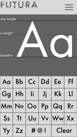
The Type Persona project asked me to select a typeface and design a mobile app that embodies its personality. I chose Futura—a geometric, modernist typeface with a bold, precise identity that pushed me to design something equally deliberate and striking.
Most of the learning happened through self-teaching. Searching for resources, working through tutorials, and trial and error were the fastest teachers I could have asked for.
02 - ideation
Ten concepts, all centered on Futura
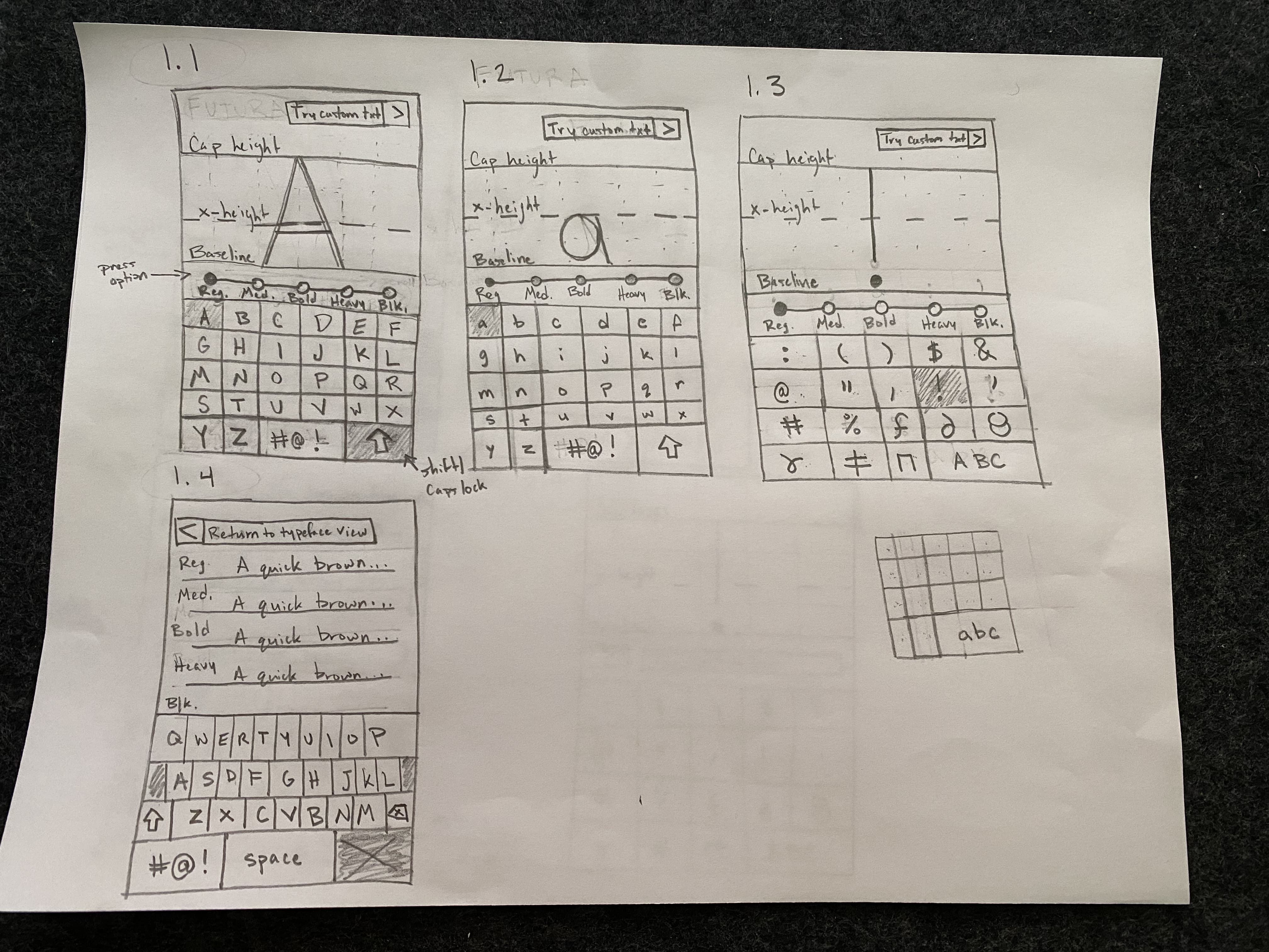
The first challenge was ideation: generating 10 distinct screen concepts that all revolved around the visual identity of Futura. This was harder than I expected. Every idea needed to be meaningfully different while still feeling coherent with the typeface's geometric, precise character.
Futura's identity (i.e. clean lines, strong geometry, high contrast, a certain modernist confidence) became the grounds for my design. Each sketch explored a different way to let the typeface speak through the interface.
03 - Low-Fidelity Sketches
Translating sketches to mobile
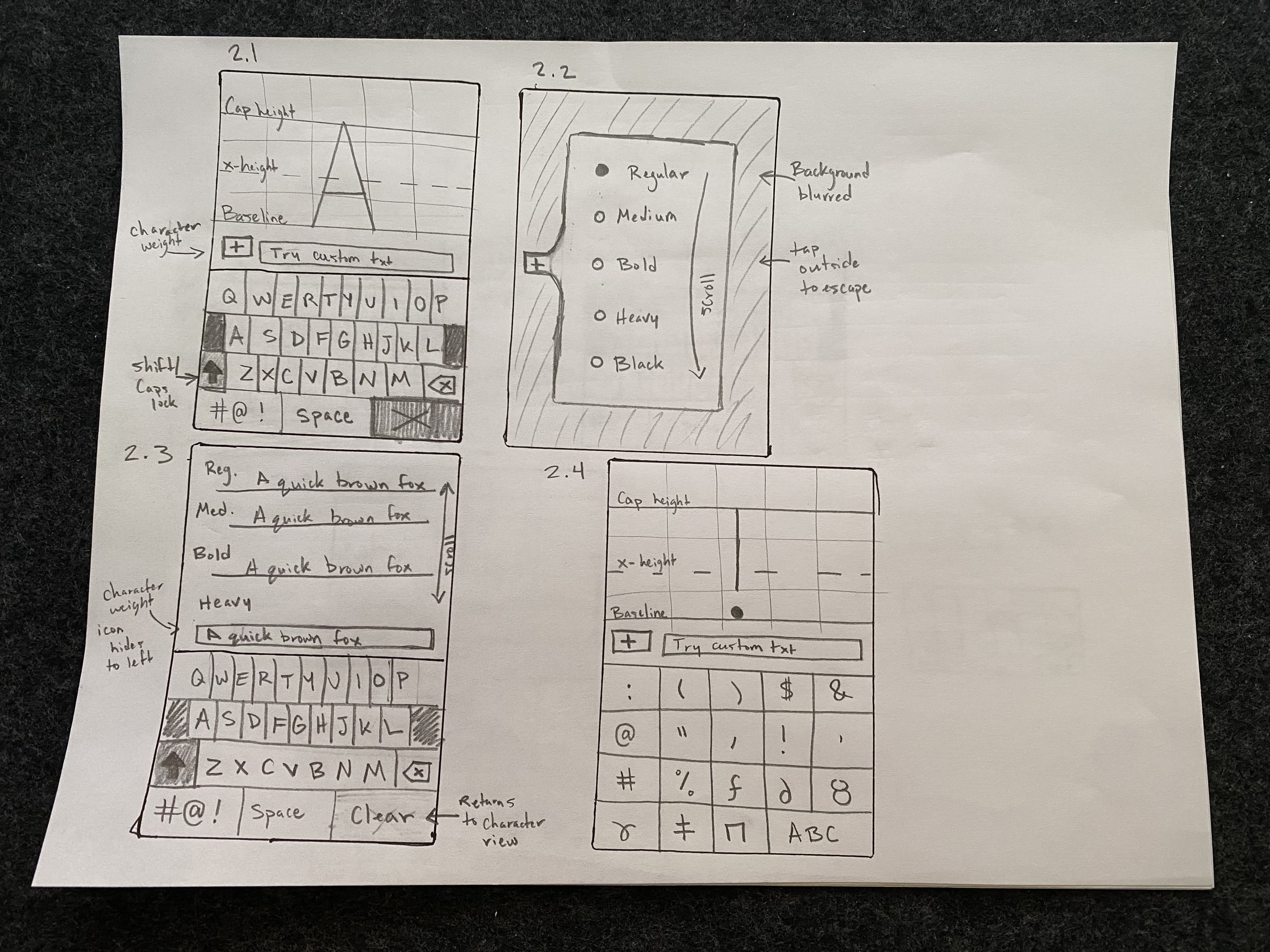
After generating 10 rough sketches, I translated every one into a low-fidelity wireframe in Figma. This was my first time designing for a mobile screen, and the shift in available space changed everything. Elements that worked on a desktop layout became crowded and awkward at mobile dimensions.
I had to make both major and minor adjustments to almost every concept. What looked clean on paper needed to be significantly reorganized once I was working within the constraints of a phone screen, a lesson has stuck with me for every project since.
04 - High-fidelity Prototype
From low-fidelity to high-fidelity prototype
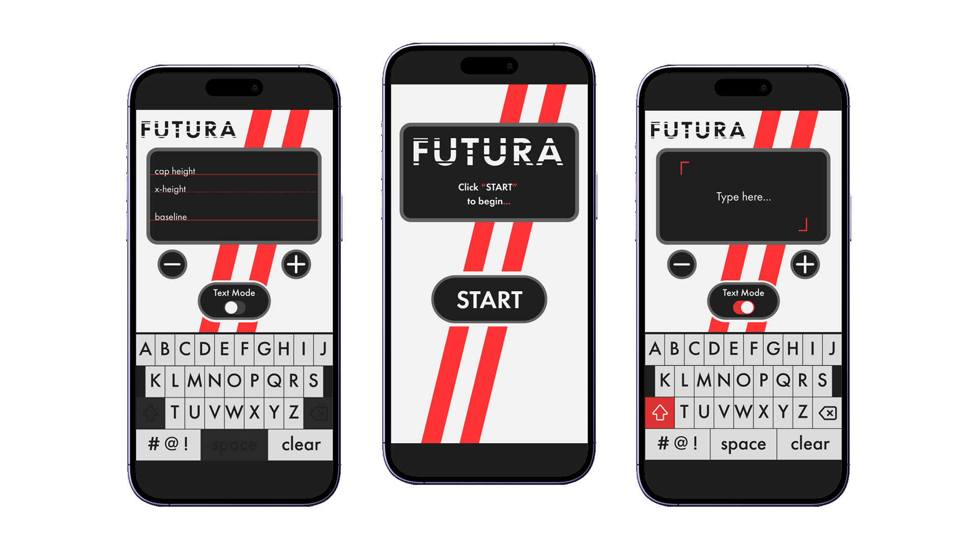
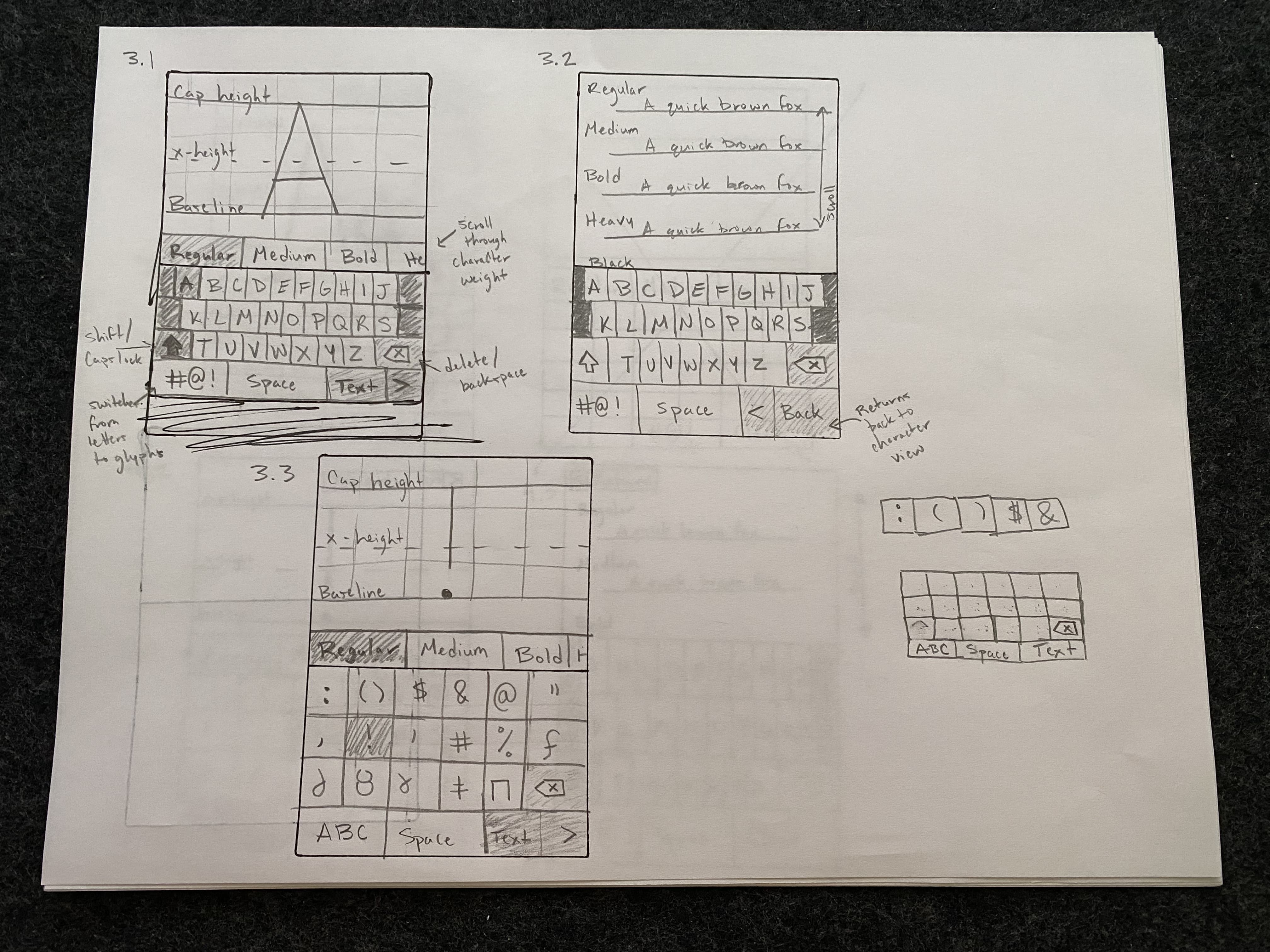
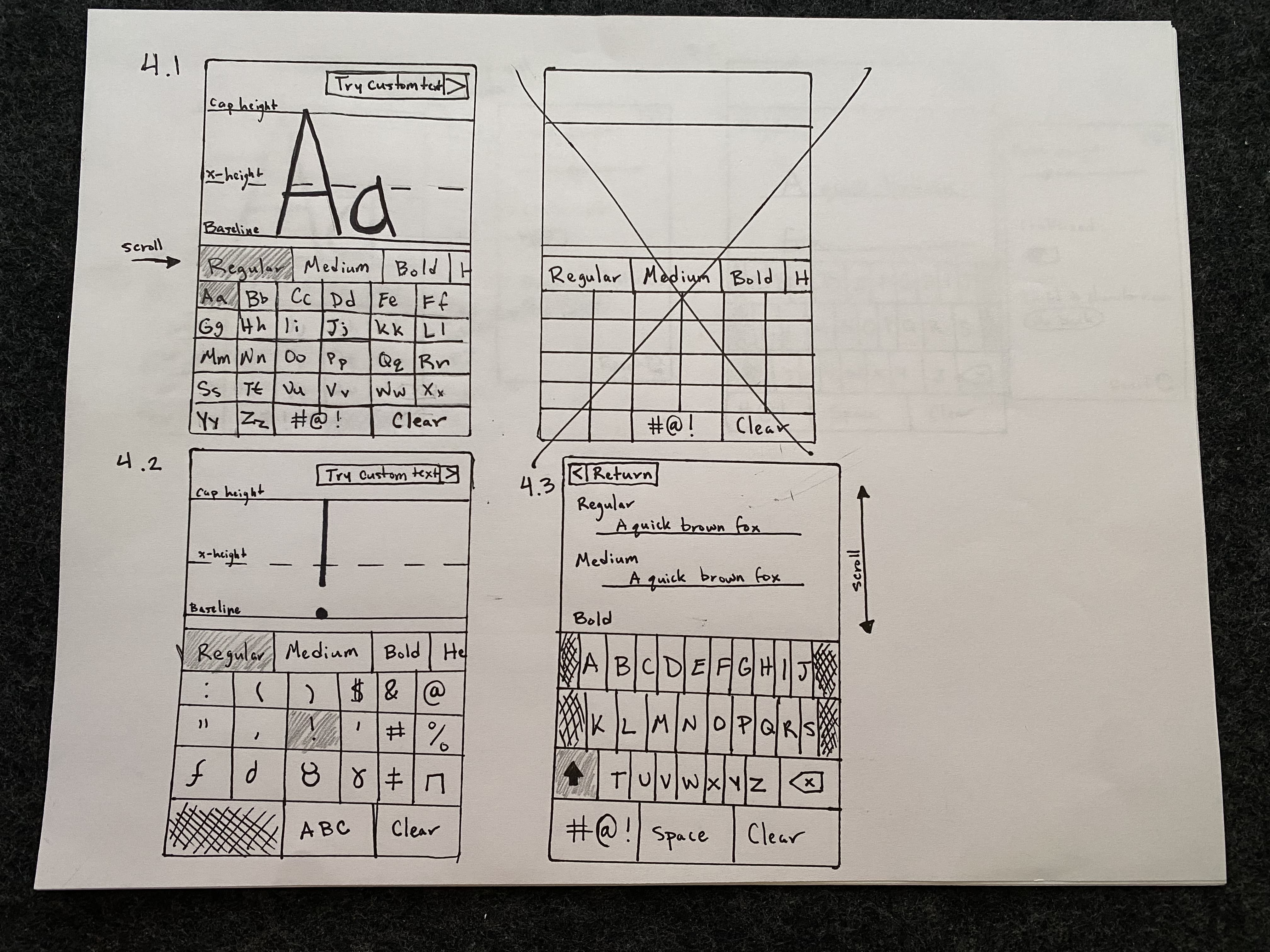
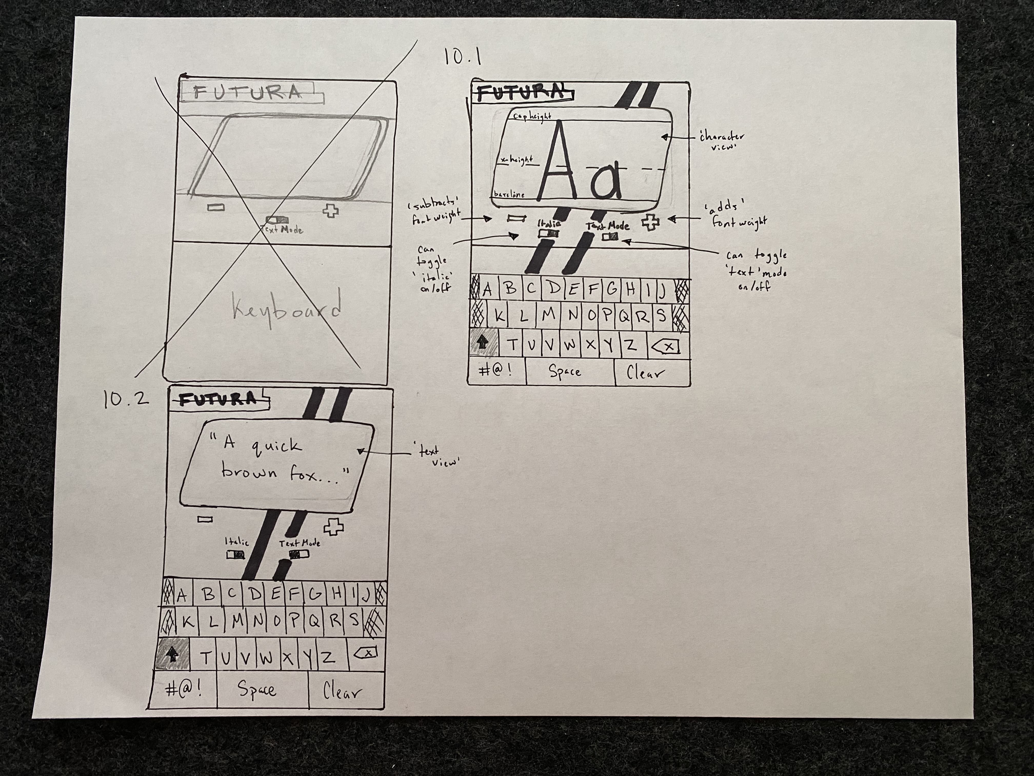
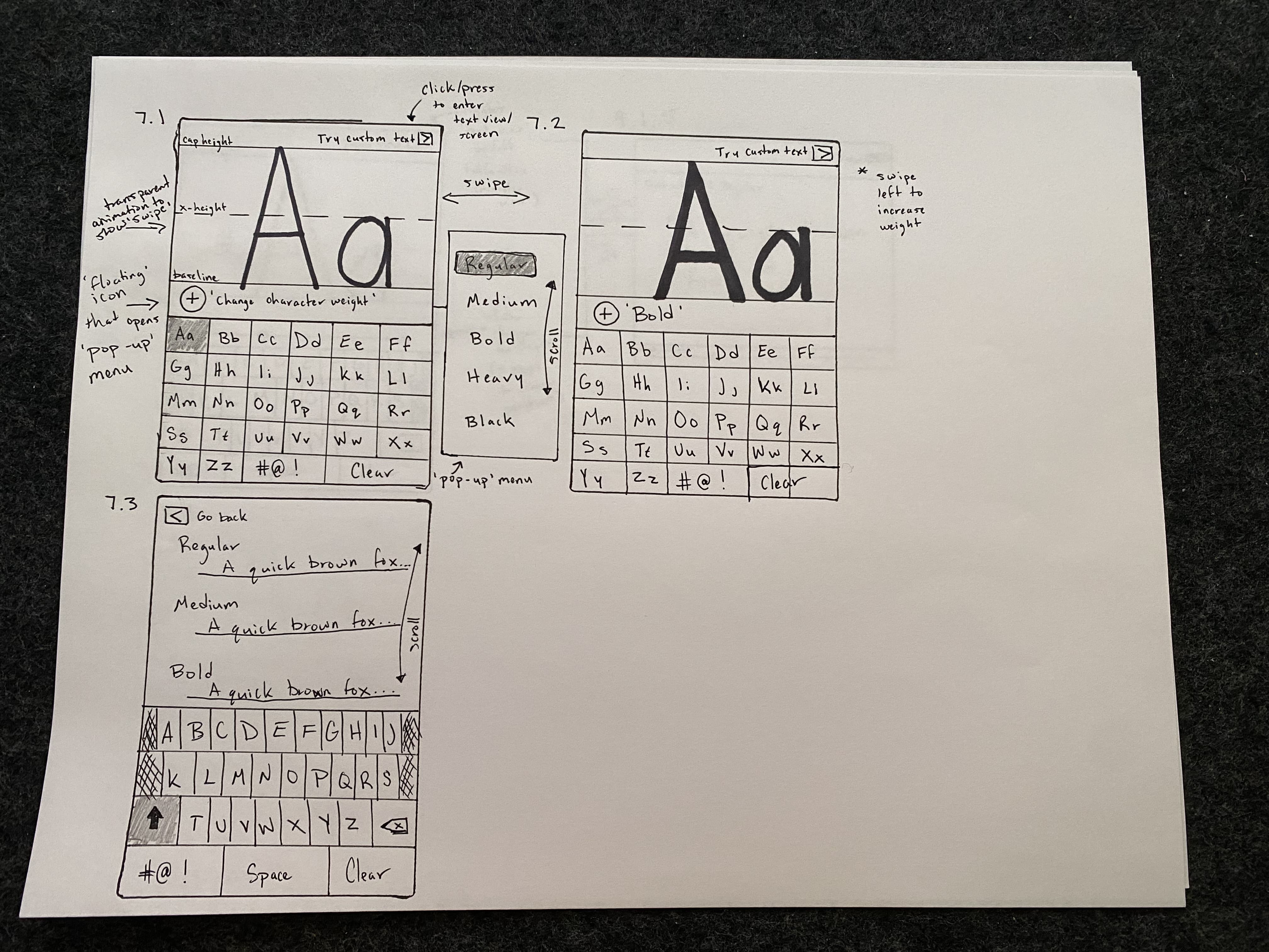
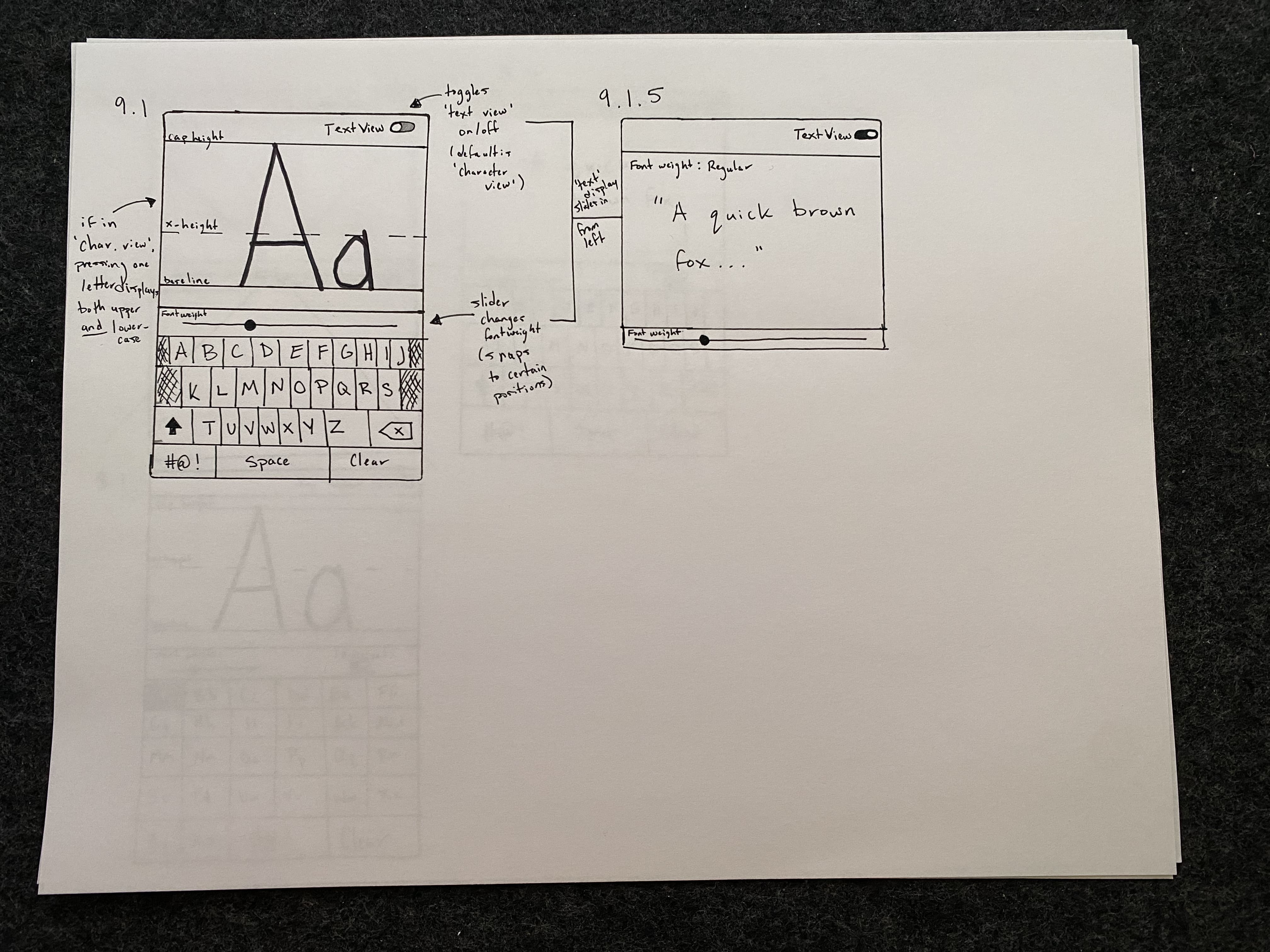
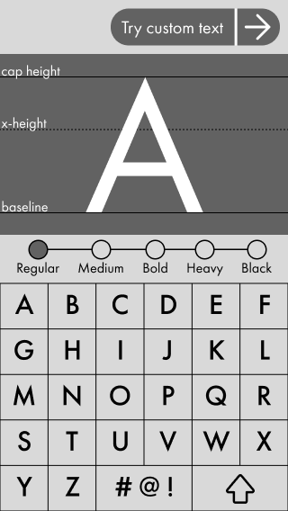
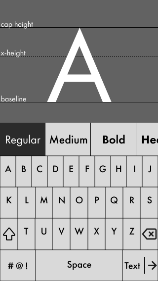
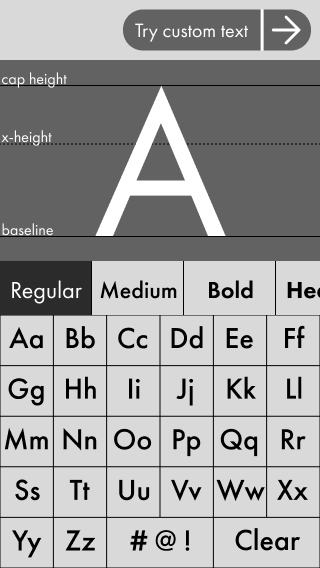
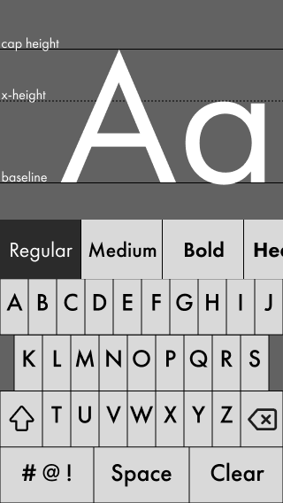
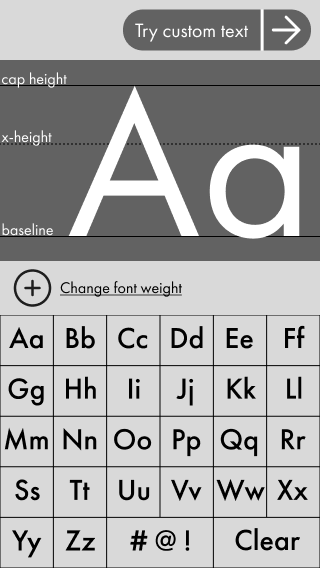
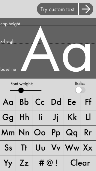
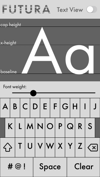
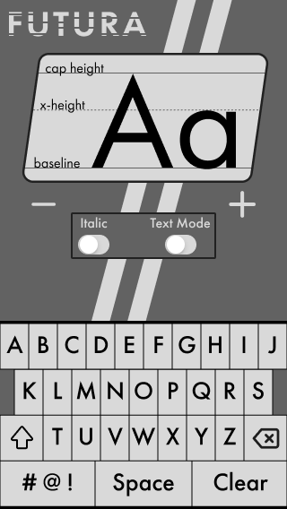
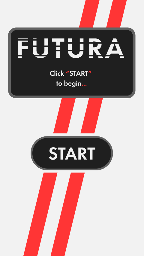
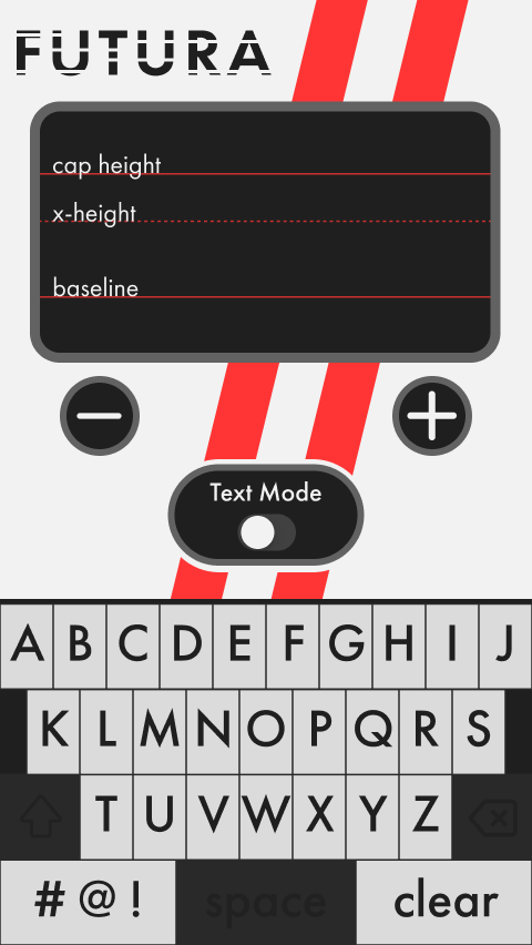
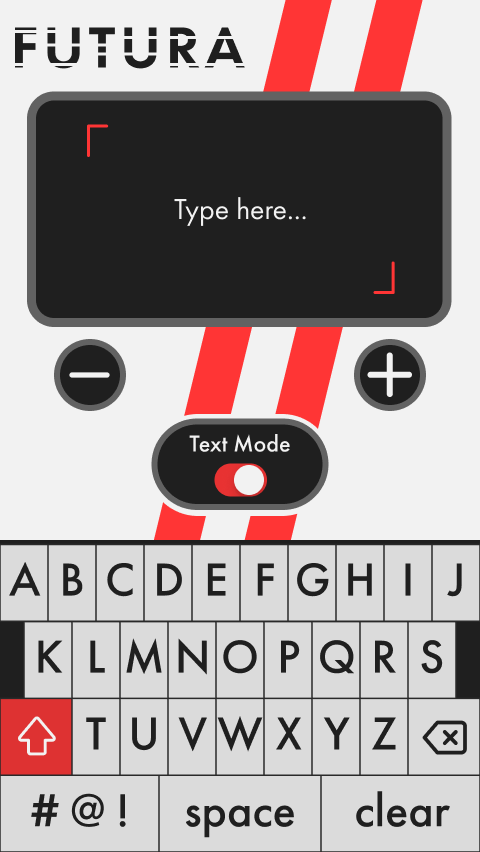
From 10 wireframes, I selected the strongest concept and developed it into a full high-fidelity mockup, adding two new screens (a Start screen and a Text Mode screen) to complete the user flow. The jump from lo-fi to hi-fi was significant given the compressed timeline, but the constraint forced decisiveness.
The final design used Futura's geometry as a visual language throughout: strong diagonal racing stripes, bold black and red, heavy geometric letterforms, and a layout that felt as precise as the typeface itself.
05 - complex prototyping
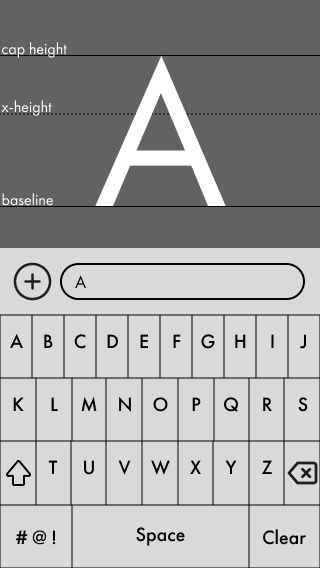
Building a working keyboard inside Figma
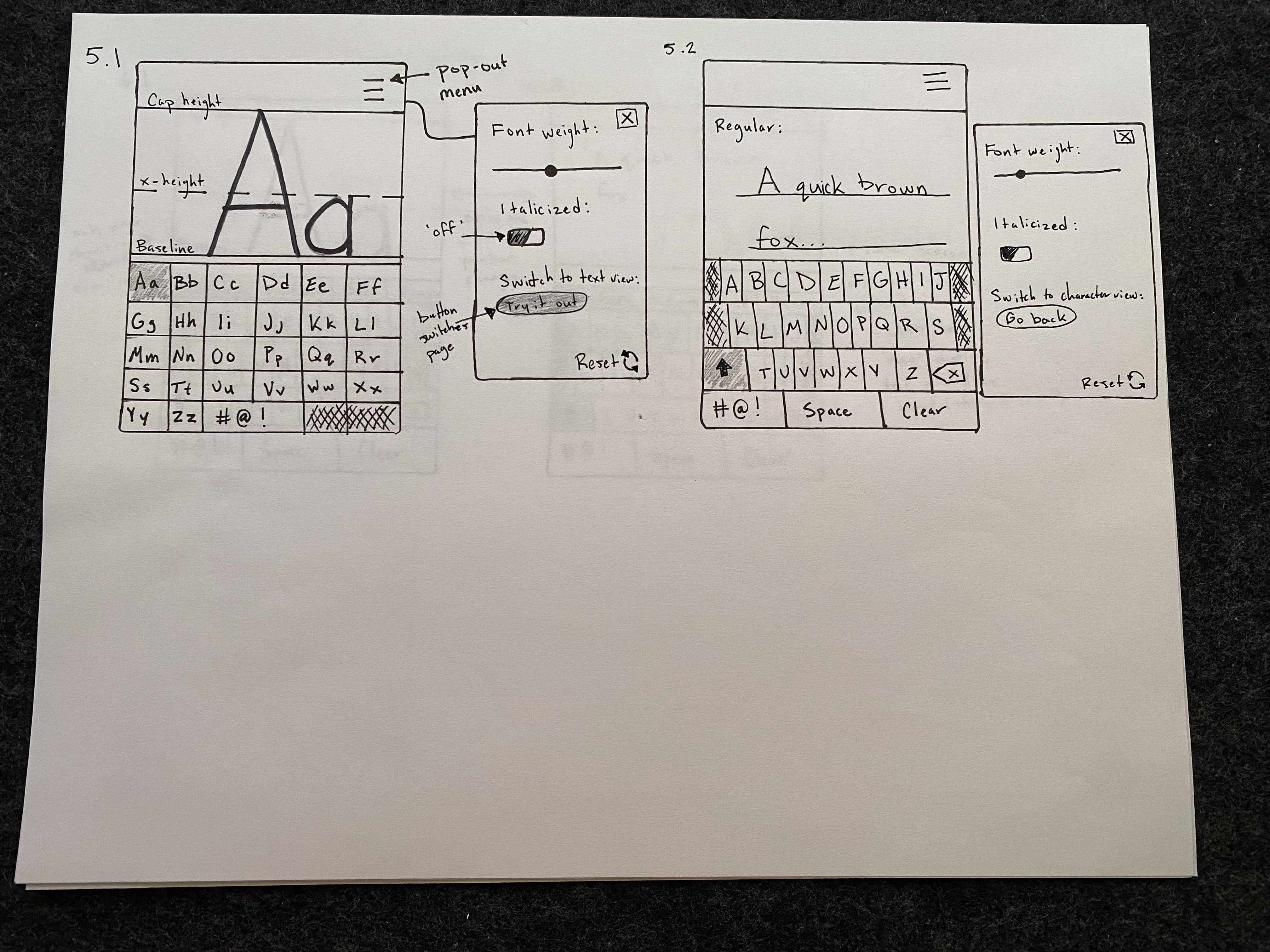
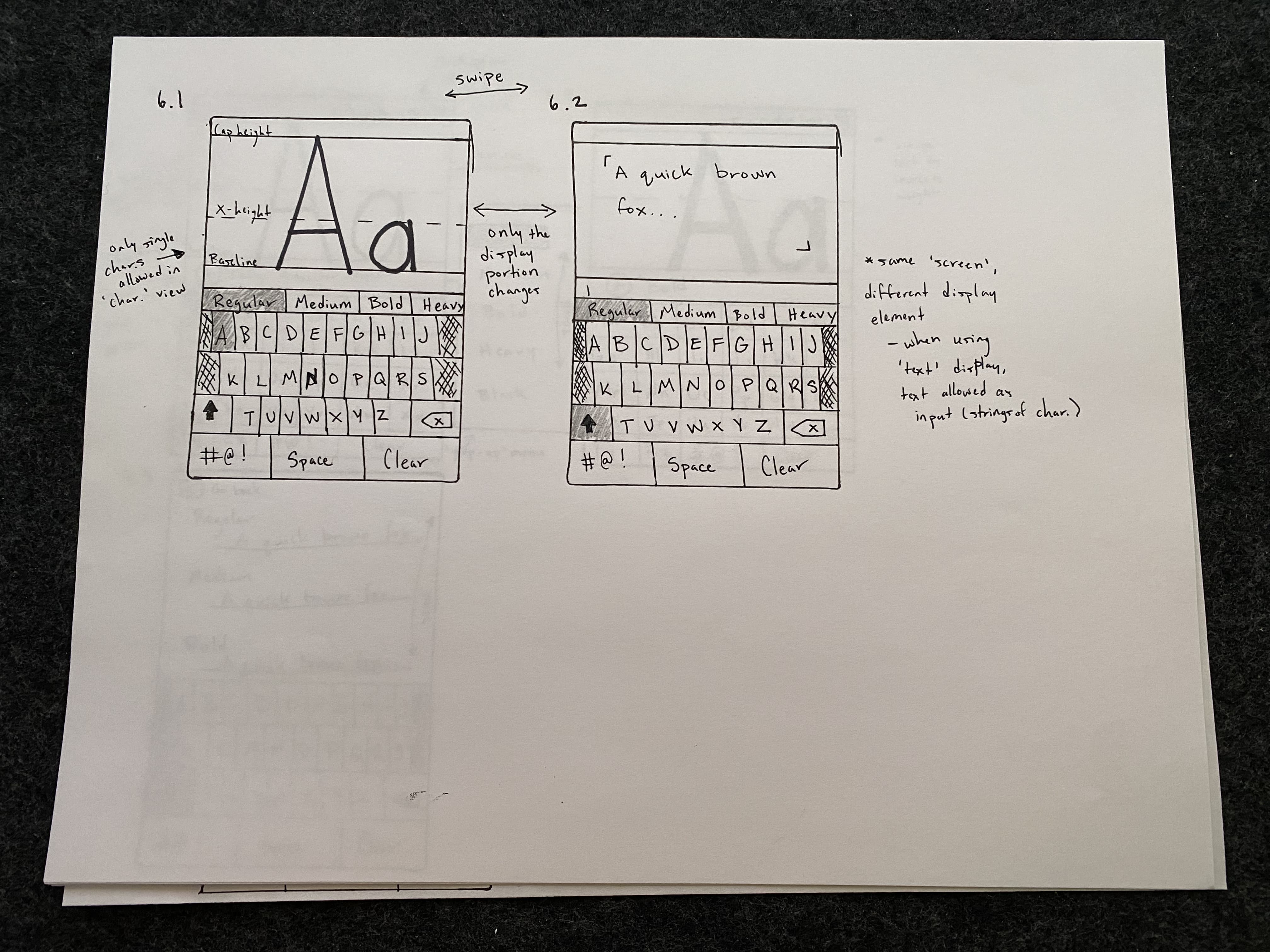
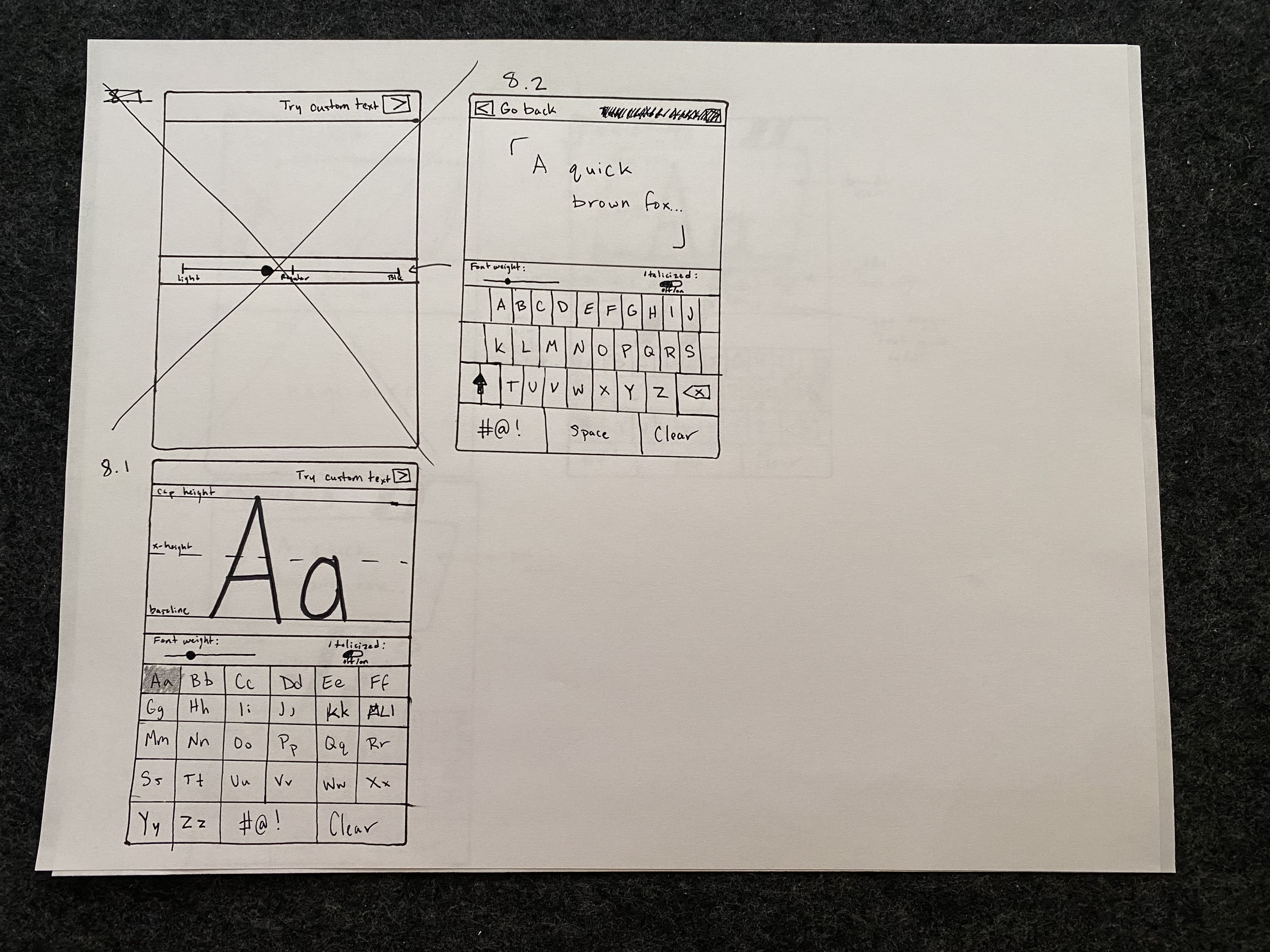
The final iteration was the most technically demanding. Before this project, I had only used Figma for basic click-through interactions on desktop layouts. This project required me to learn Figma's conditional logic and component system to build something genuinely functional.
The result: a fully working keyboard within the prototype. Users could type individual glyphs or full sentences in Text Mode, and adjust font weight using the +/− controls all within a single Figma file. Every key had to respond correctly in both modes, with conditionals handling the state changes between them.
06 - outcome & Reflection
Countless hours of work paid off
To this day, this remains one of the most technically complex prototypes I've built, and it fundamentally changed what I thought was possible inside Figma. Though I was challenged, I've carried the lessons learned into every design since then.