Ux research • usability testing • figma
Tutoring Club
A research-driven prototype redesign of my employer's website.
Team
Carlos Diaz (Solo)
Role
UX / UI Designer, Researcher
Timeline
3 months, 2025
Tools
Figma, Google Suite
Ux research • usability testing • figma
A research-driven prototype redesign of my employer's website.
Team
Carlos Diaz (Solo)
Role
UX / UI Designer, Researcher
Timeline
3 months, 2025
Tools
Figma, Google Suite
01 - overview
Redesigning my employer's website
This project was my first major introduction to Figma and the full UX design process. The focus was on the existing Tutoring Club of Corona, CA website, while the goal was to, through thorough research, identify real usability problems and produce a high-fidelity prototype that resolved key issues.
02 - Heuristic evaluation
Finding the problems before asking users
Before any user research could begin, I conducted a heuristic evaluation of the existing site using Jakob Nielsen's 10 general principles for interaction design. This gave me a structured lens to assess the site systematically, rather than rely on gut feeling.
The evaluation revealed issues that weren't localized to a single page, but were scattered throughout the site. The three most pressing problems were related to the site's navigation, information hierarchy, and visual design. These findings became the foundation for the research questions that followed.
03 - User research
Letting real users confirm the findings
Using the heuristic evaluation as a guide, I developed a survey administered to 11 representative users of the Tutoring Club site. Questions were designed to uncover user expectations, frustrations, and behaviors, not just surface-level feelings.
Sample questions included: "Which parts of the design make the website difficult to use?" and "What might you expect to find when visiting the Tutoring Club website?" The responses helped verify initial findings and introduced new insights about how users were mentally modeling and interacting with the site.
"I couldn't find the Testimonials page – I didn't even know it existed."
– Usability test participant
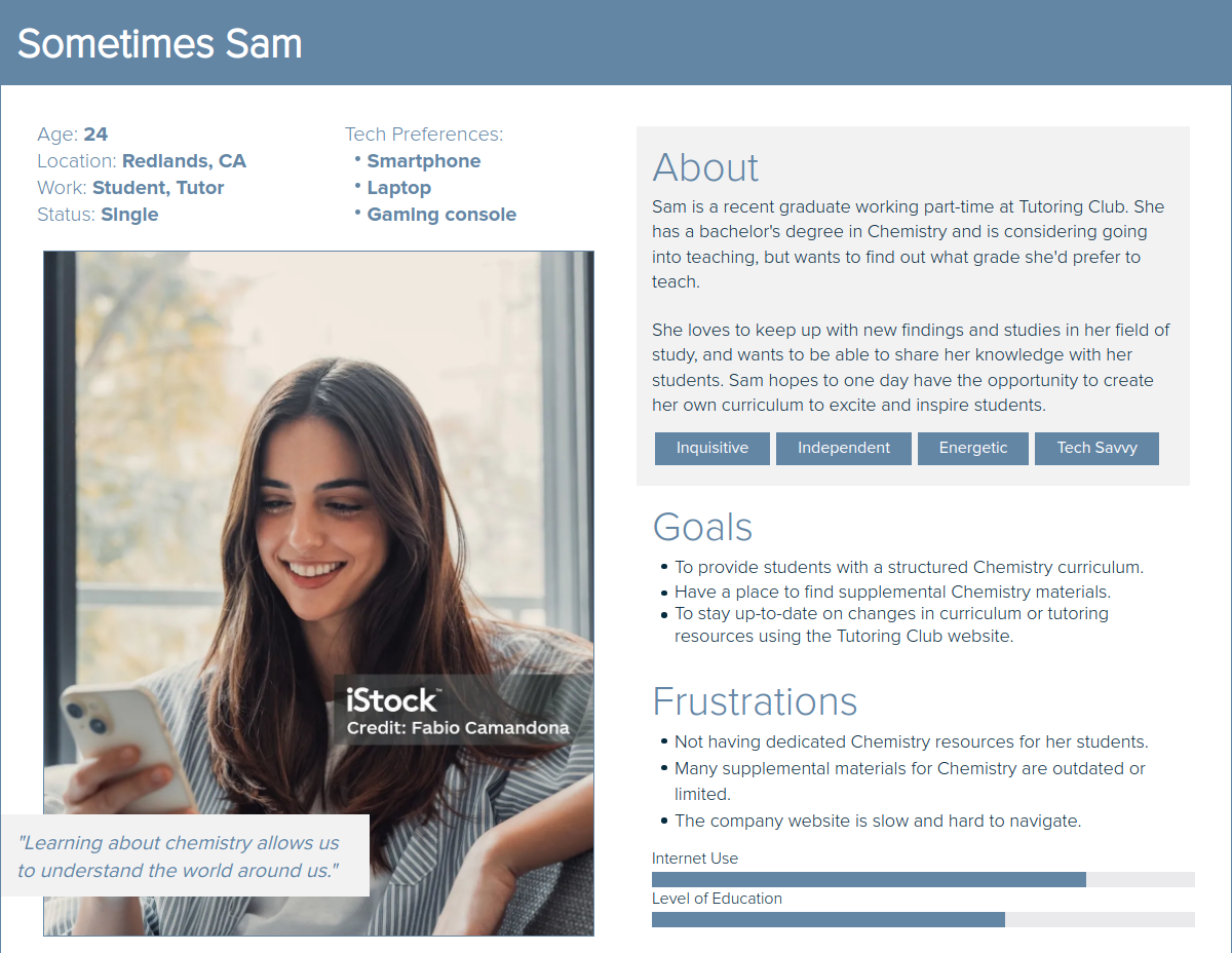
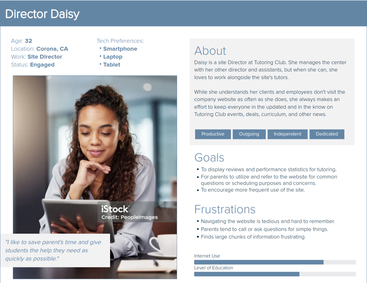
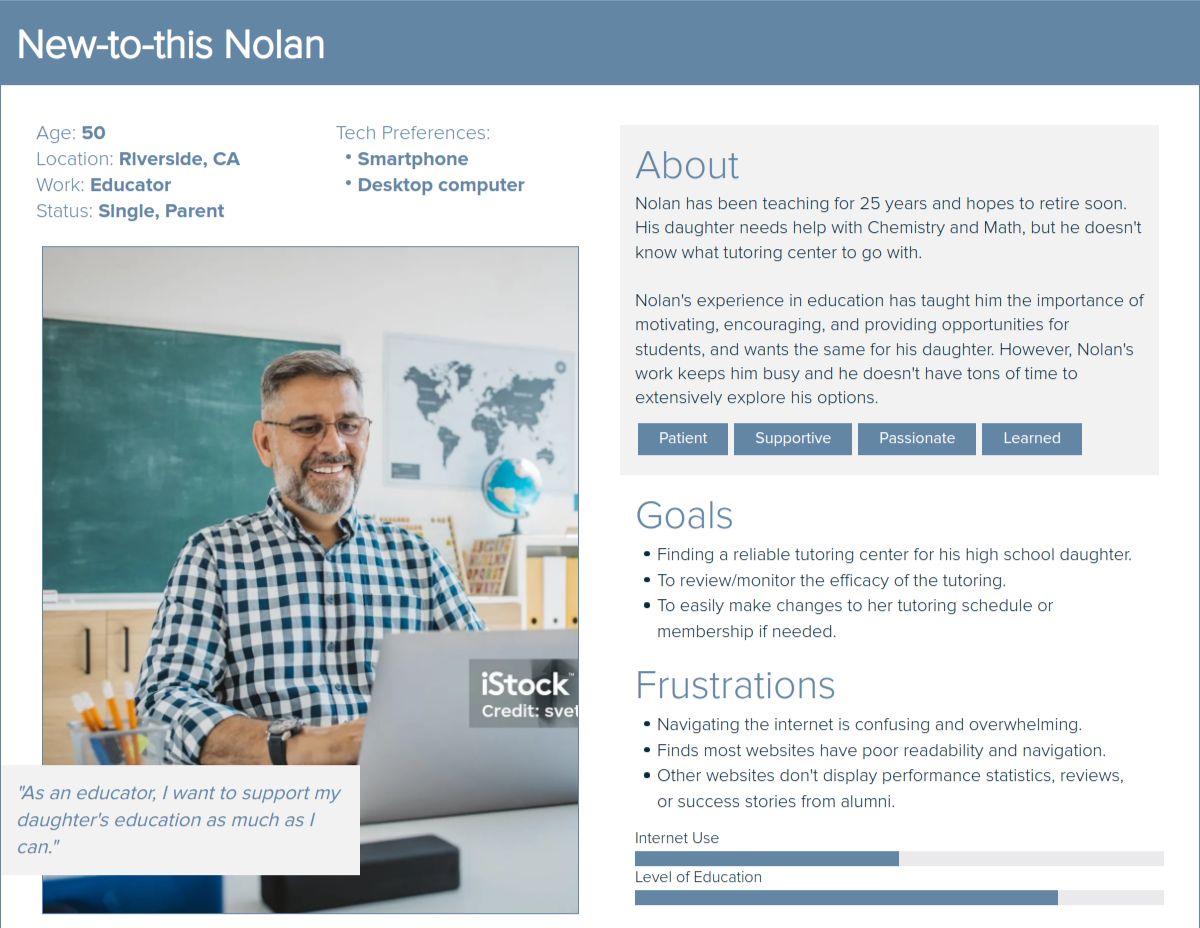
04 - USer personas
Three personas, three different perspectives
Survey data informed the creation of 3 representative user personas, each built around a distinct user type with unique needs, motivations, and demographics. The personas ensured that subsequent design decisions were grounded in real user goals rather than assumptions.
Furthermore, each persona captured a different relationship with the site: a parent researching tutoring options for their child, a high school student preparing for college entrance exams, and a user with accessibility needs requiring clearer readability and navigation.
05 - usability testing
Three scenarios, twelve tasks, five participant
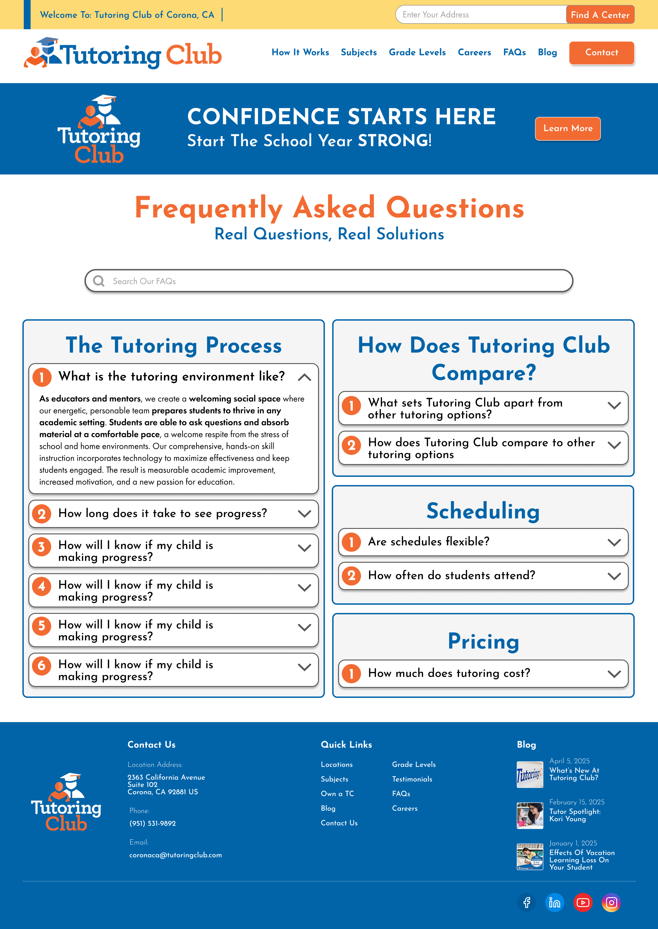
With personas in hand, I designed a usability test for the existing site: 3 scenarios and 12 tasks covering navigation, information clarity, readability, content organization, and visual design. For each participant, I recorded their path taken, time to complete each task, and success rate.
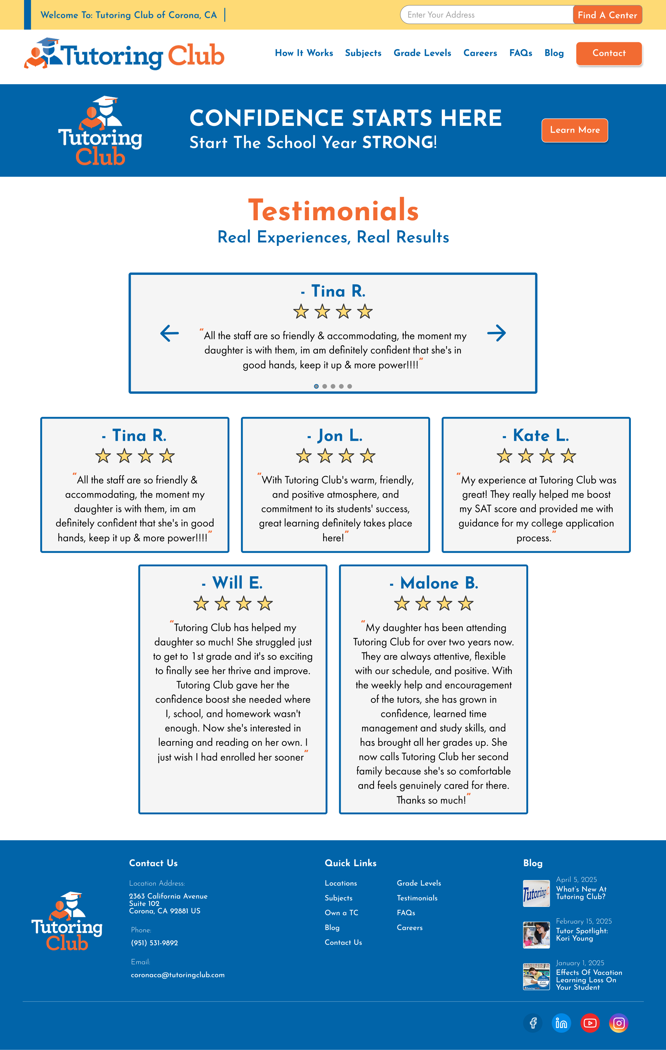
The results were clear: 4 out of 5 participants encountered major issues with the FAQs page, all 5 had difficulty locating the Testimonials page, and most reported minor issues on the Home and How It Works pages (particularly around information density and readability).
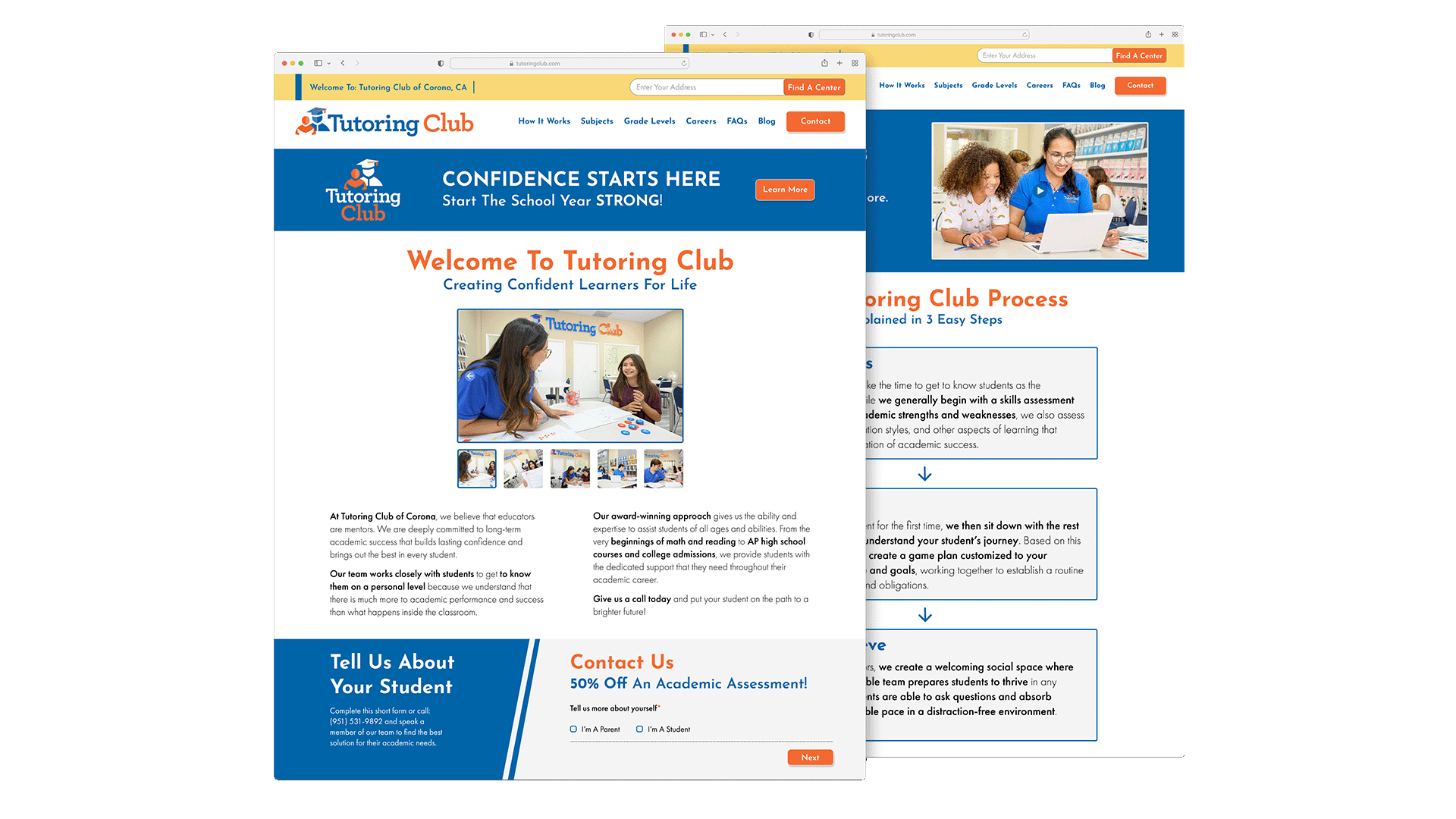
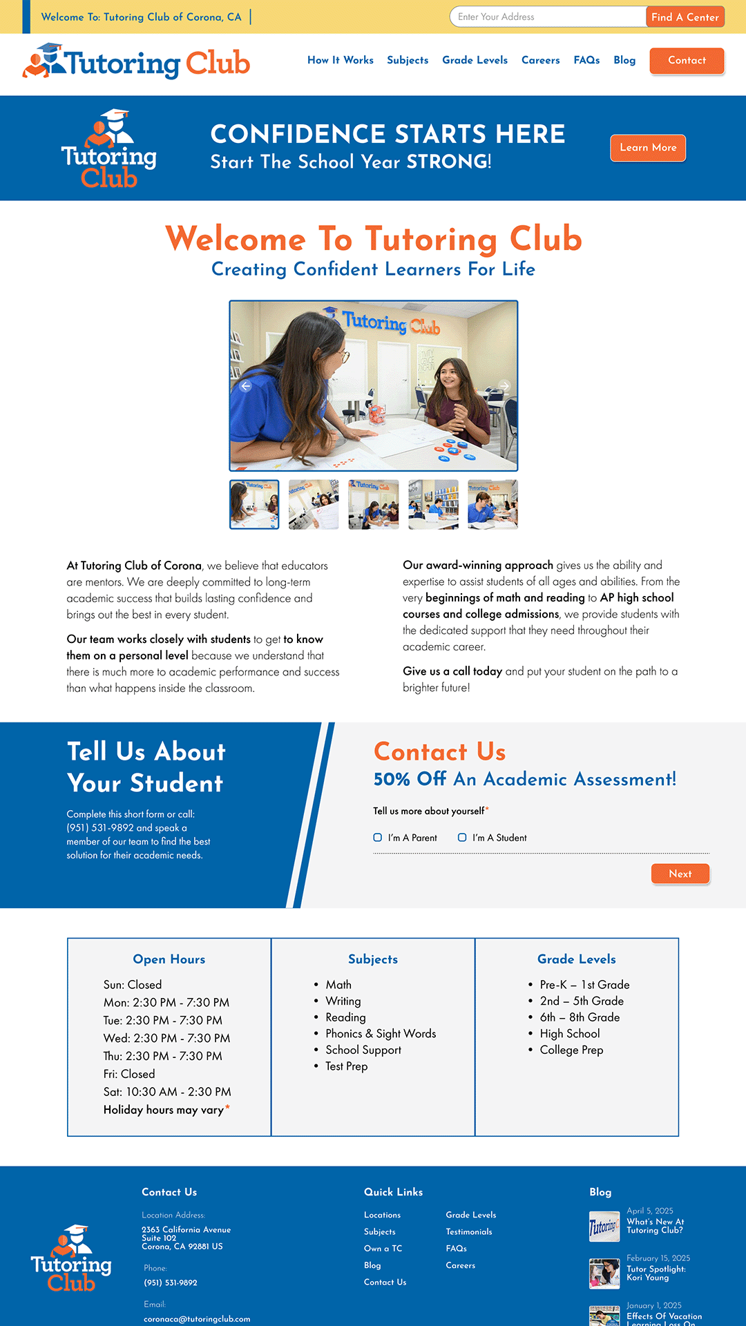
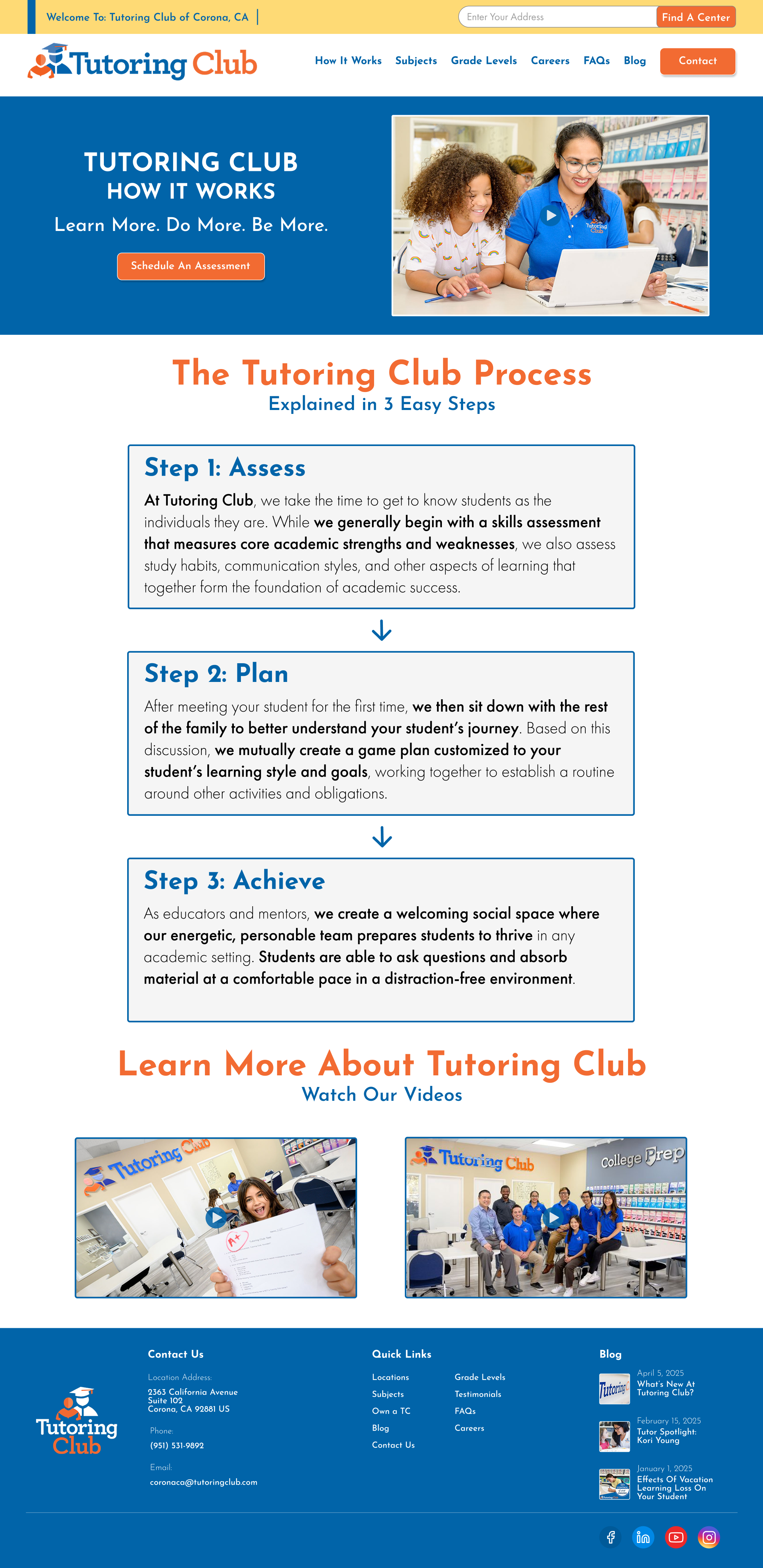
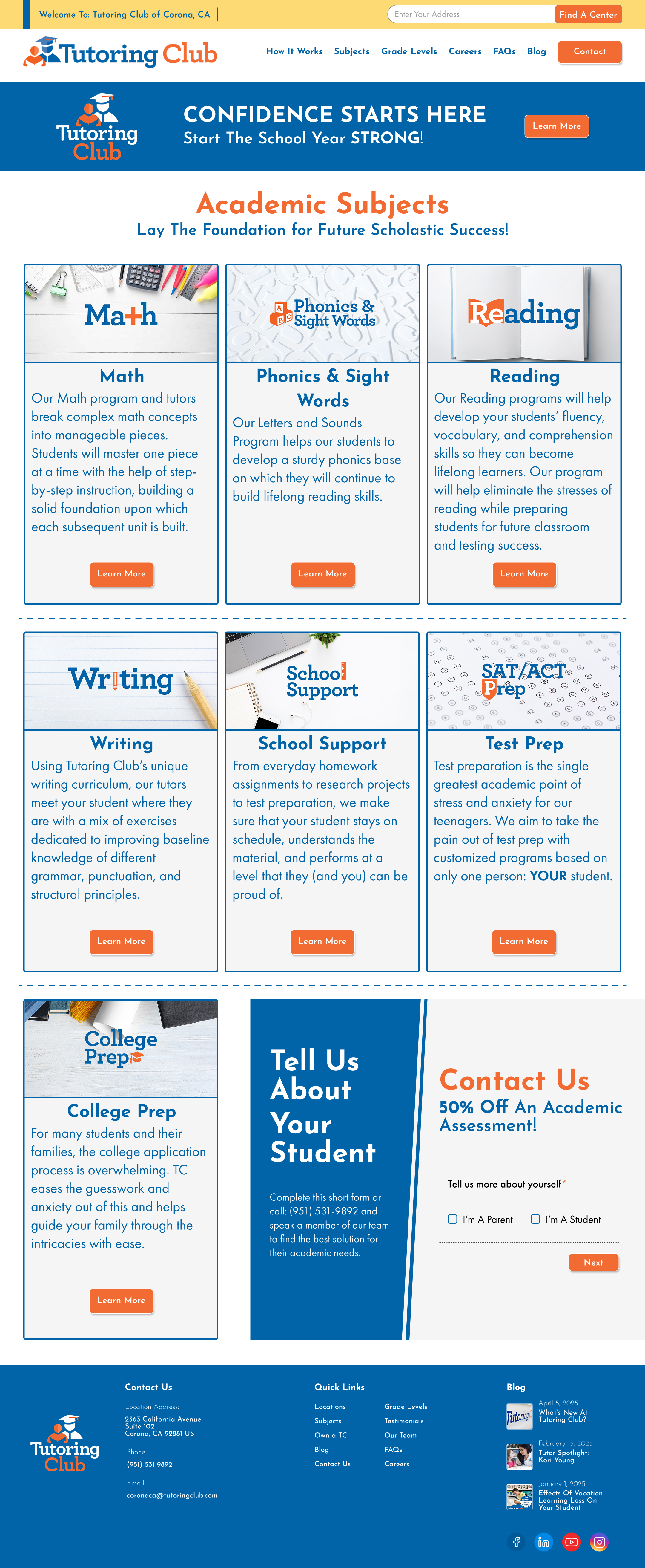
06 - prototype
Five pages, redesigned with purpose
Armed with research data, I built a high-fidelity prototype in Figma, marking my first major project using this particular design tool. The redesign addressed the most severe issues found: navigation structure, FAQ usability, Testimonials discoverability, and visual clarity across the Home, How It Works, Subjects, FAQs, and Testimonials pages.
07 - outcome
A complete UX process, from start to finish
This project was one of the most complete and thorough UX processes I've carried out thusfar. It introduced me to the full design workflow: from heuristic evaluation and user research, to prototype creation and stakeholder presentation. In a sense, it gave me a real sense of what a career in UX would look like day to day.
Looking back, it remains one of my proudest design achievements. The research-to-design pipeline felt natural, and seeing usability data directly shape my design decisions made every choice feel justified rather than arbitrary.