Interaction design • Mobile App • figma
Fast Tix
A mobile app concept for fast, seamless event ticket purchasing.
Team
Carlos Diaz (solo)
Role
UX/UI Designer
Timeline
2 weeks
Tools
Figma
Interaction design • Mobile App • figma
A mobile app concept for fast, seamless event ticket purchasing.
Team
Carlos Diaz (solo)
Role
UX/UI Designer
Timeline
2 weeks
Tools
Figma
01 - overview
Designing a mobile ticketing app for three venues
Fast Tix is a mobile ticketing concept designed around three music venues in Arizona. The project demanded a high-fidelity prototype that balanced tight stakeholder constraints with a fast, frictionless user experience, putting speed and simplicity at the center of every design decision.
02 - Requirements & Guidelines
Working with strict stakeholder requirements
This project came with clearly defined boundaries and only the features specified by stakeholders were in scope [with no room for additions]. Rather than viewing this as a limitation, I used it as an opportunity to go deeper on the core experience, refining each feature until it felt polished and purposeful.
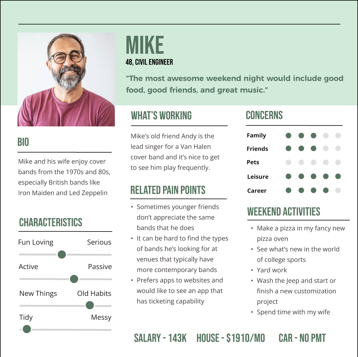
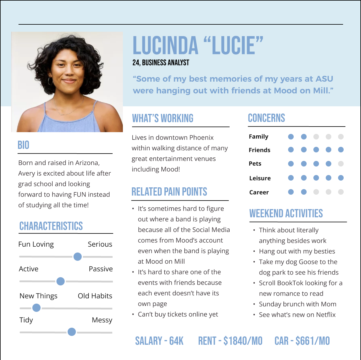
03 - user Personas
The two personas that shaped the design
Two user personas were provided at the start of the project, each grounding design decisions in expected user needs. Their demographics, motivations, and goals directly informed the core user flows, ensuring the app served their needs and goals.
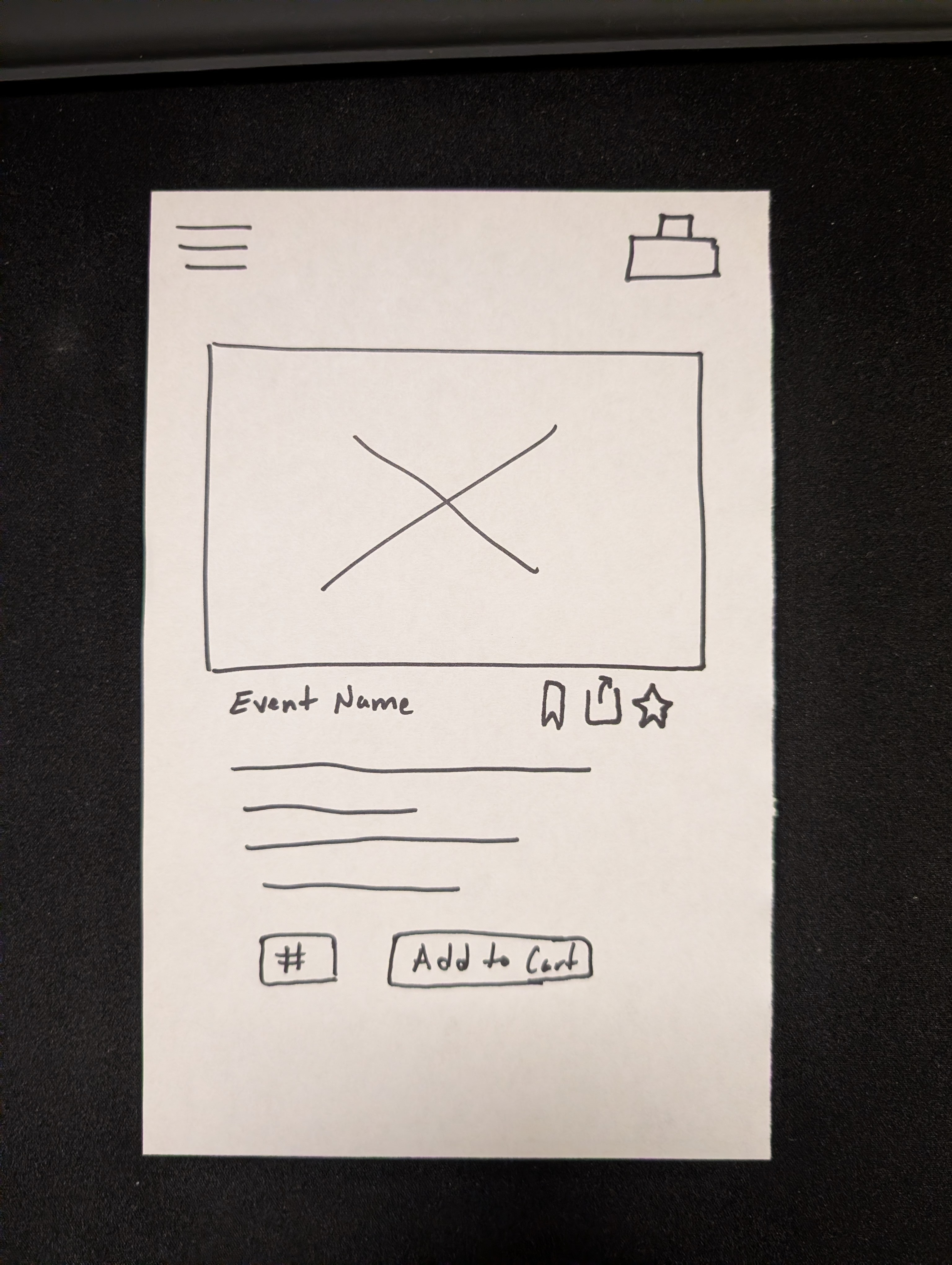
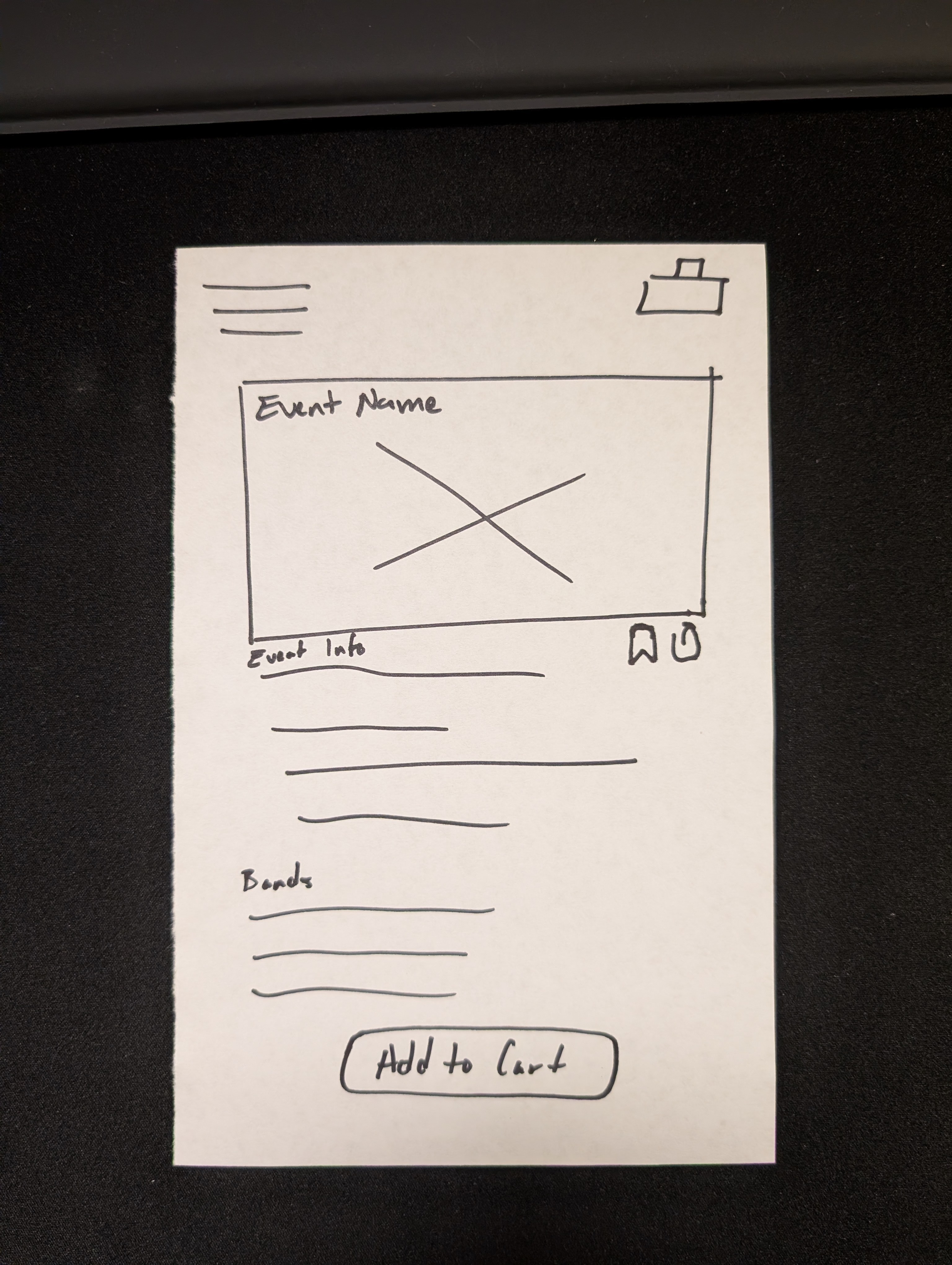
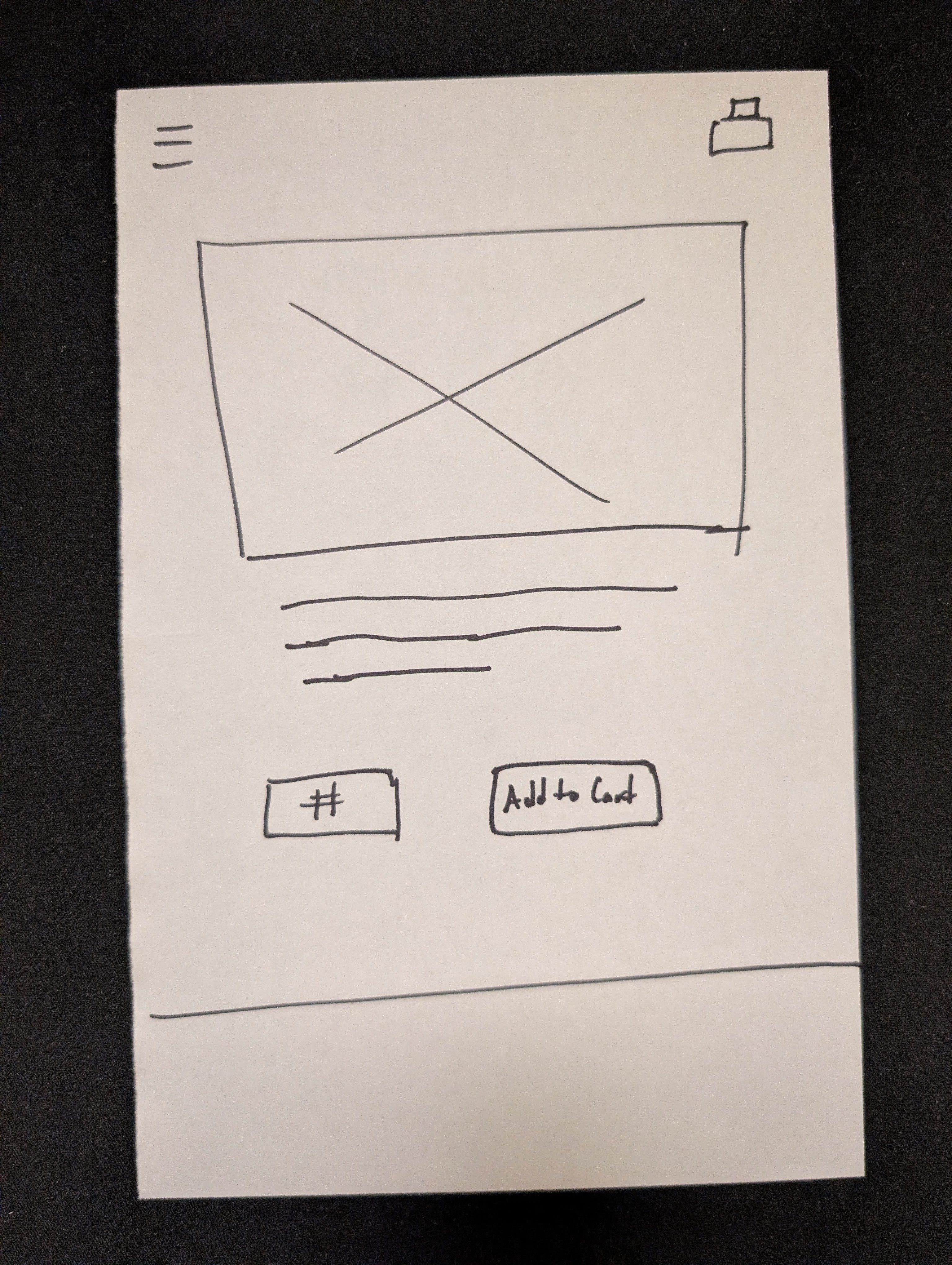
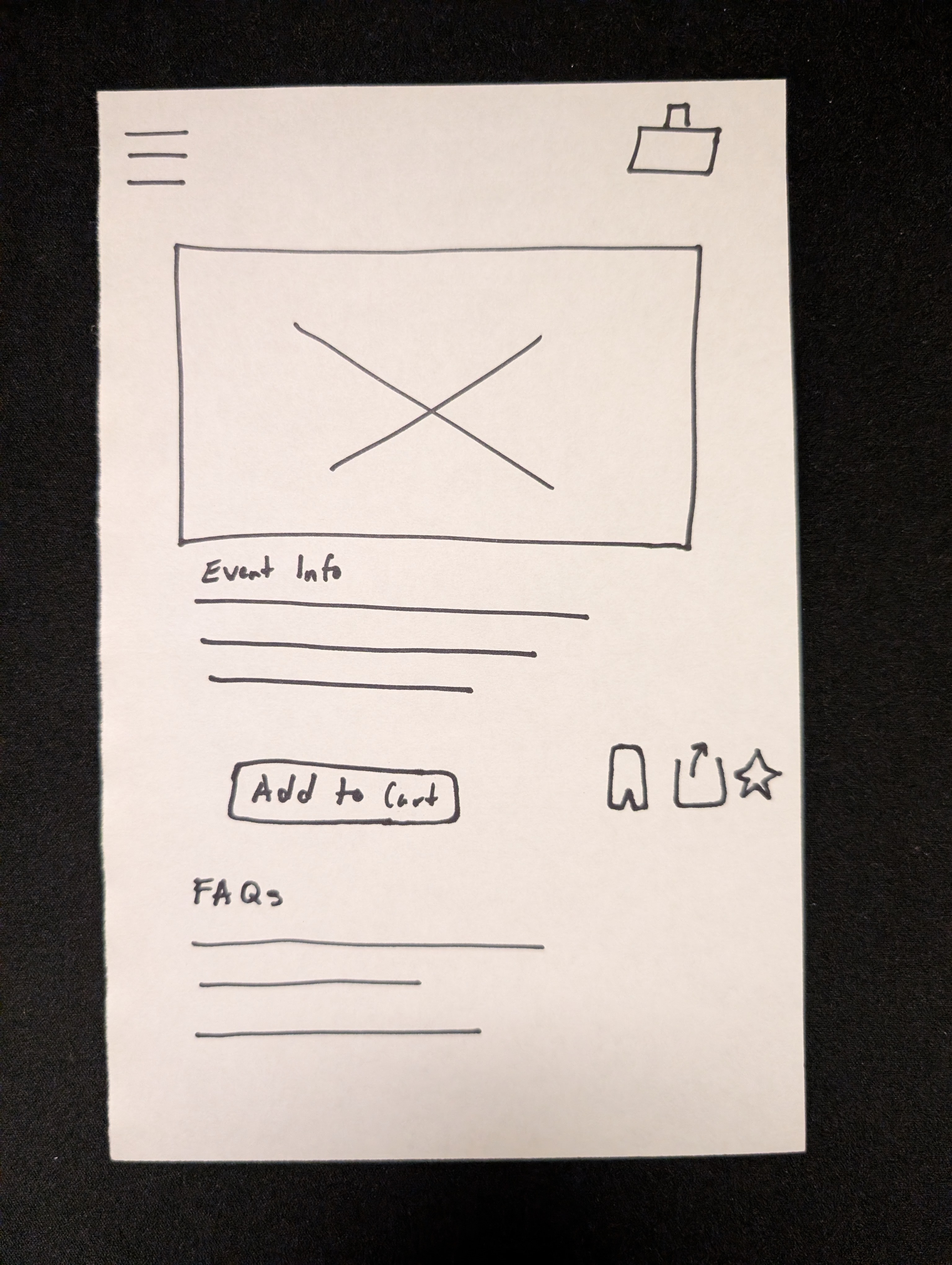
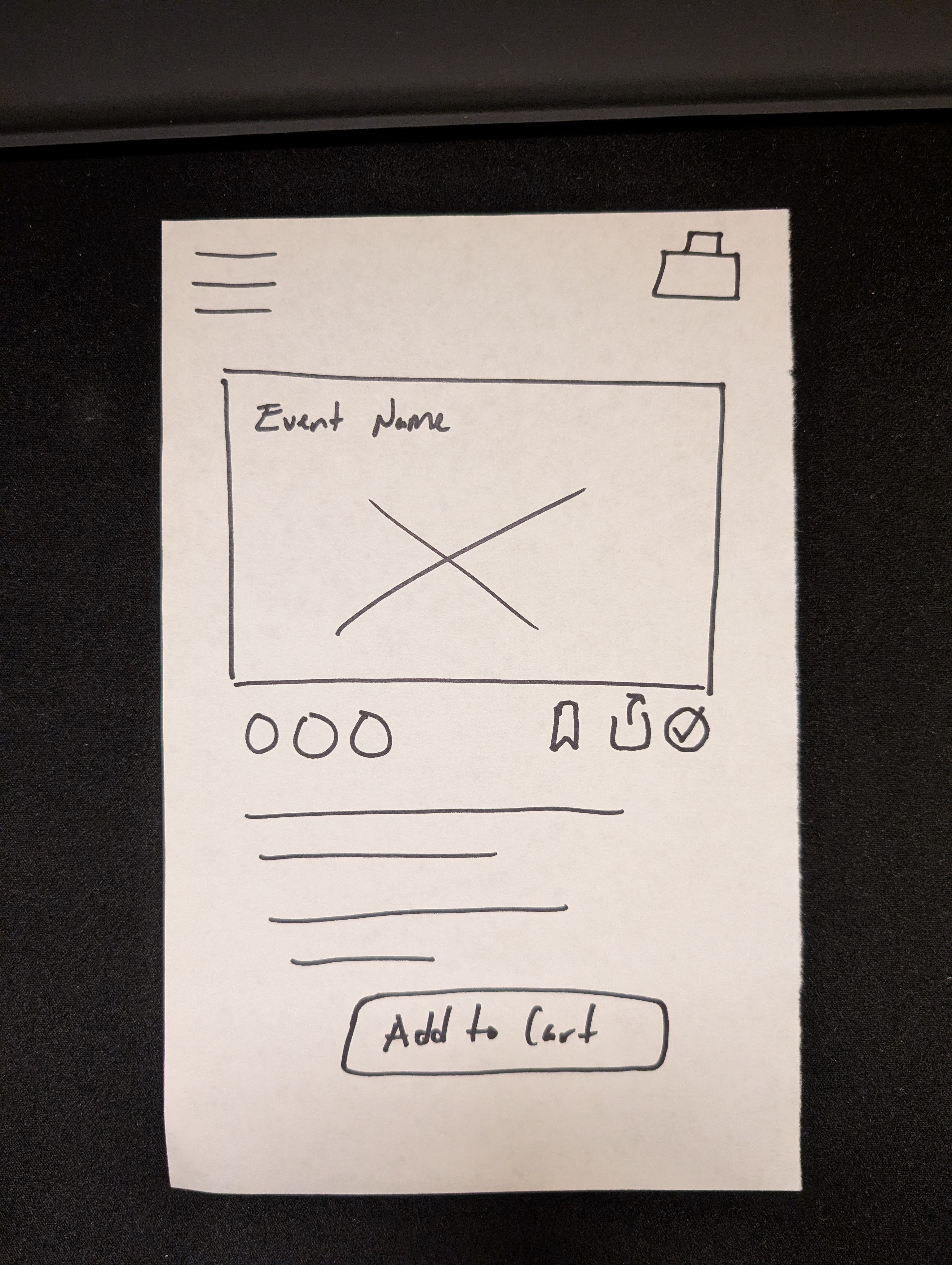
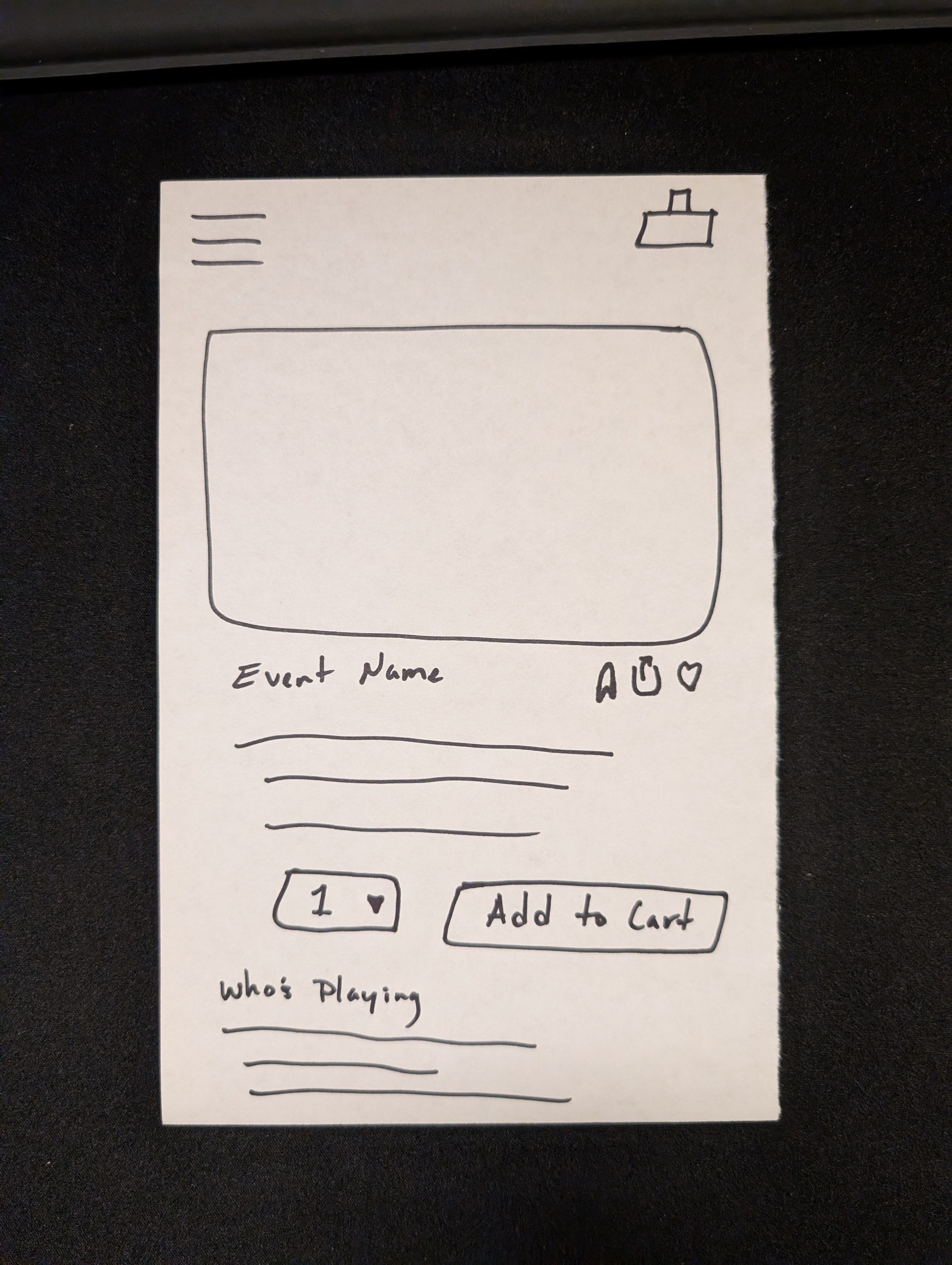
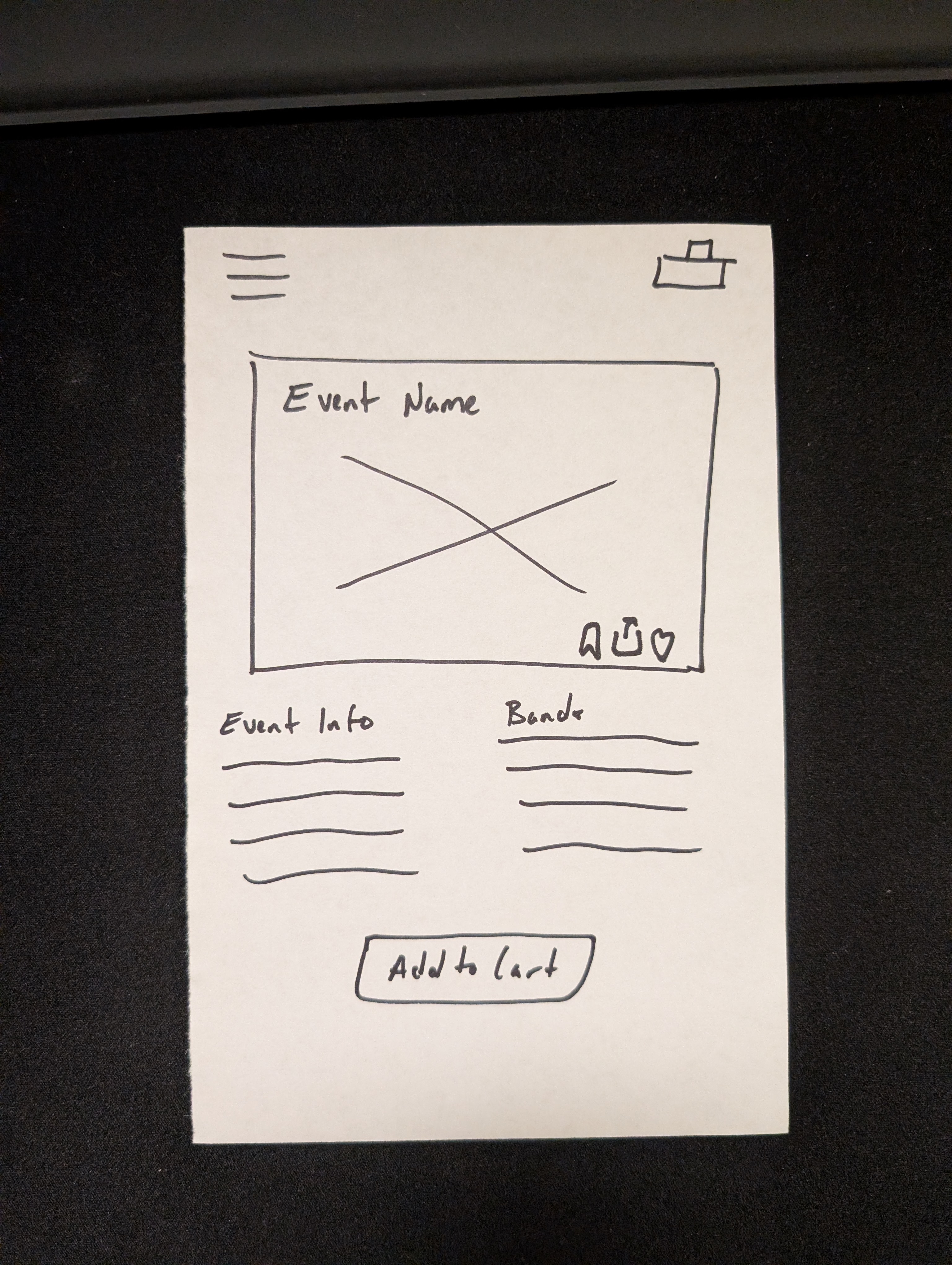
04 - Low-fidelity sketches
Rapid ideation with Crazy 8s
Before opening Figma, I ran a solo Crazy 8s session to rapidly explore layout directions for the event page, one of the app's most critical screens in the ticket purchasing flow. Sketching first kept ideas loose and prevented premature commitment to any single direction.
While only one concept moved forward, the exercise surfaced tradeoffs early and sharpened my design thinking before a single pixel was placed.
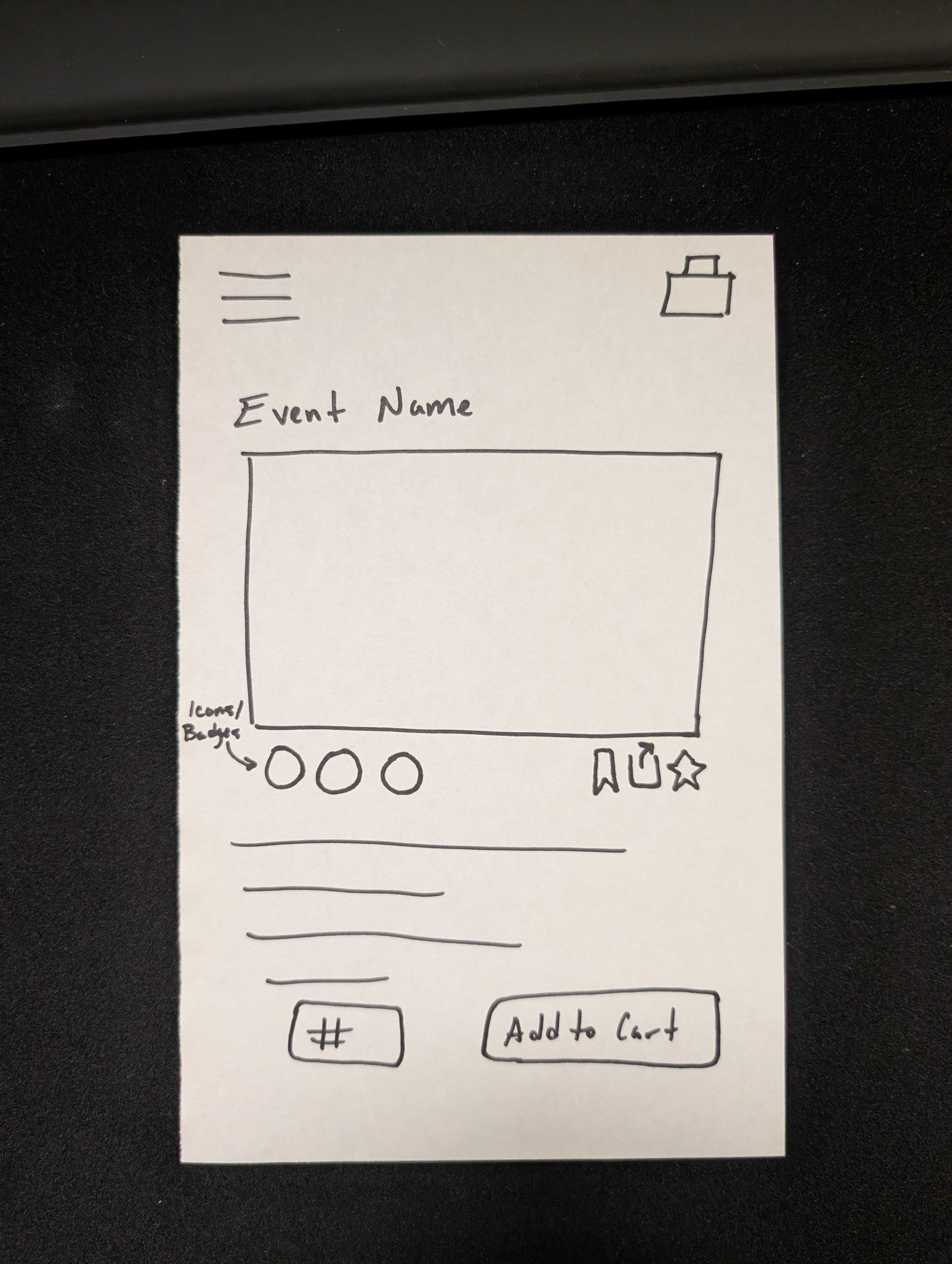
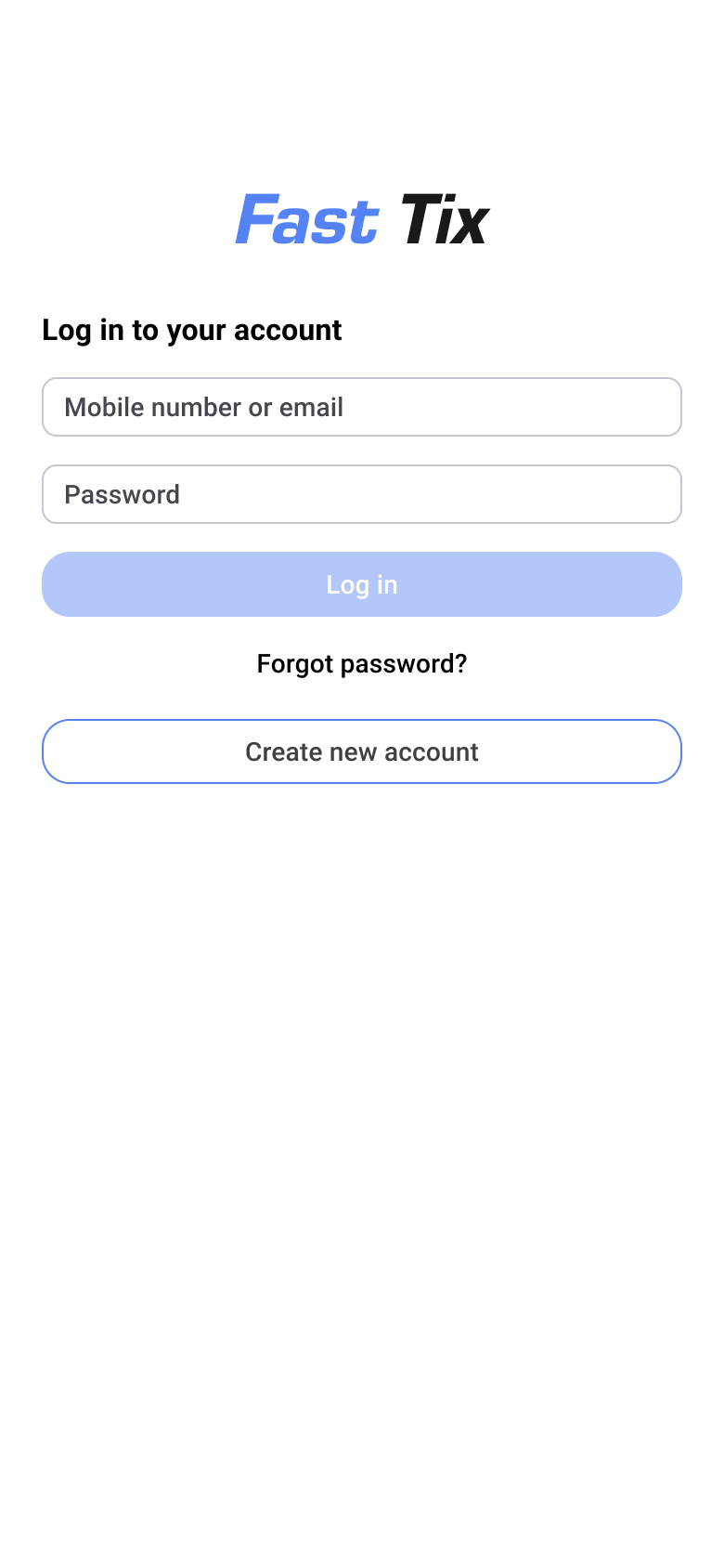
05 - High-fidelity wireframes
From sketches to high-fidelity wireframes
With concepts established, I moved into Figma to build high-fidelity wireframes. I used the jump in fidelity as an opportunity to confront the mobile medium's core constraint: limited screen real estate. Every layout decision had to serve a purpose.
Figma's auto-layout, reusable components, and consistent alignment ensured UI elements were predictable and easy to locate, reducing cognitive load across every screen.


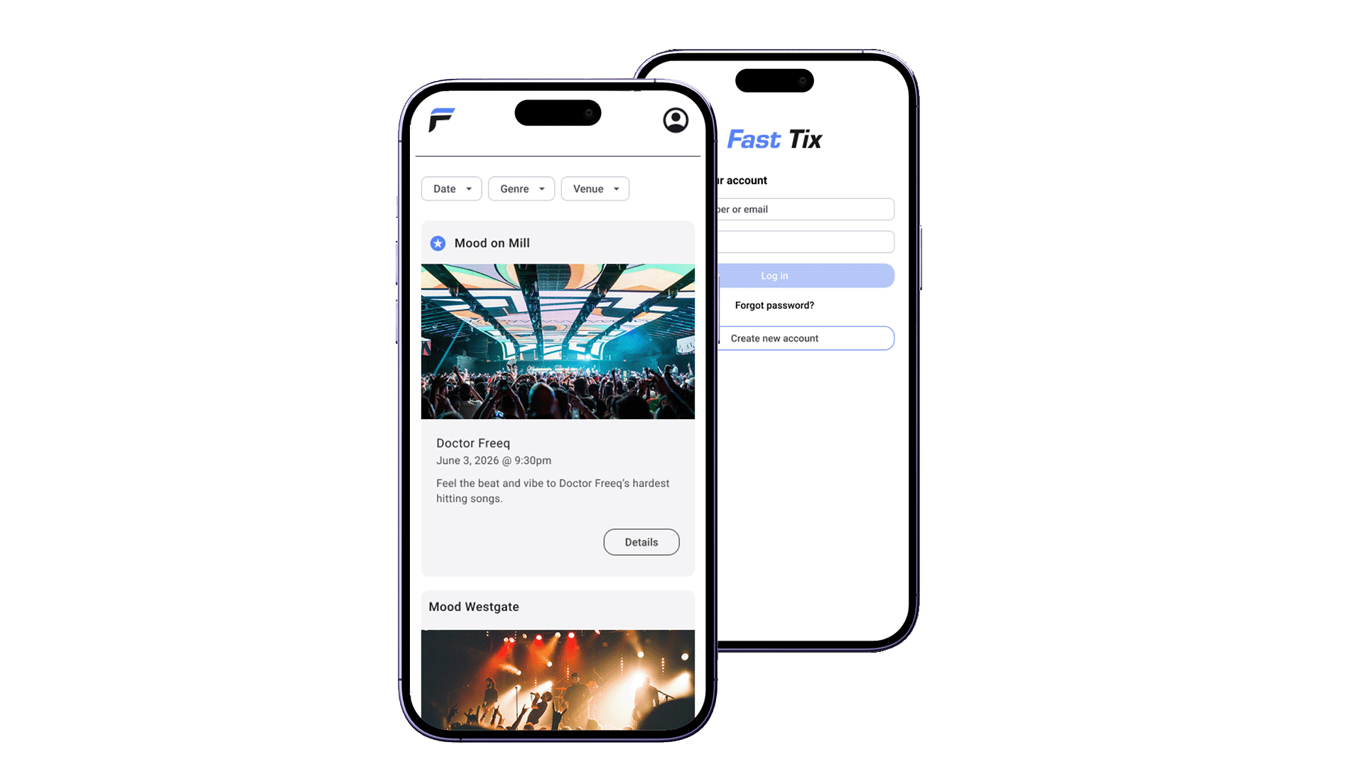
06 - high-fidelity Prototype
Making the wireframes interactable
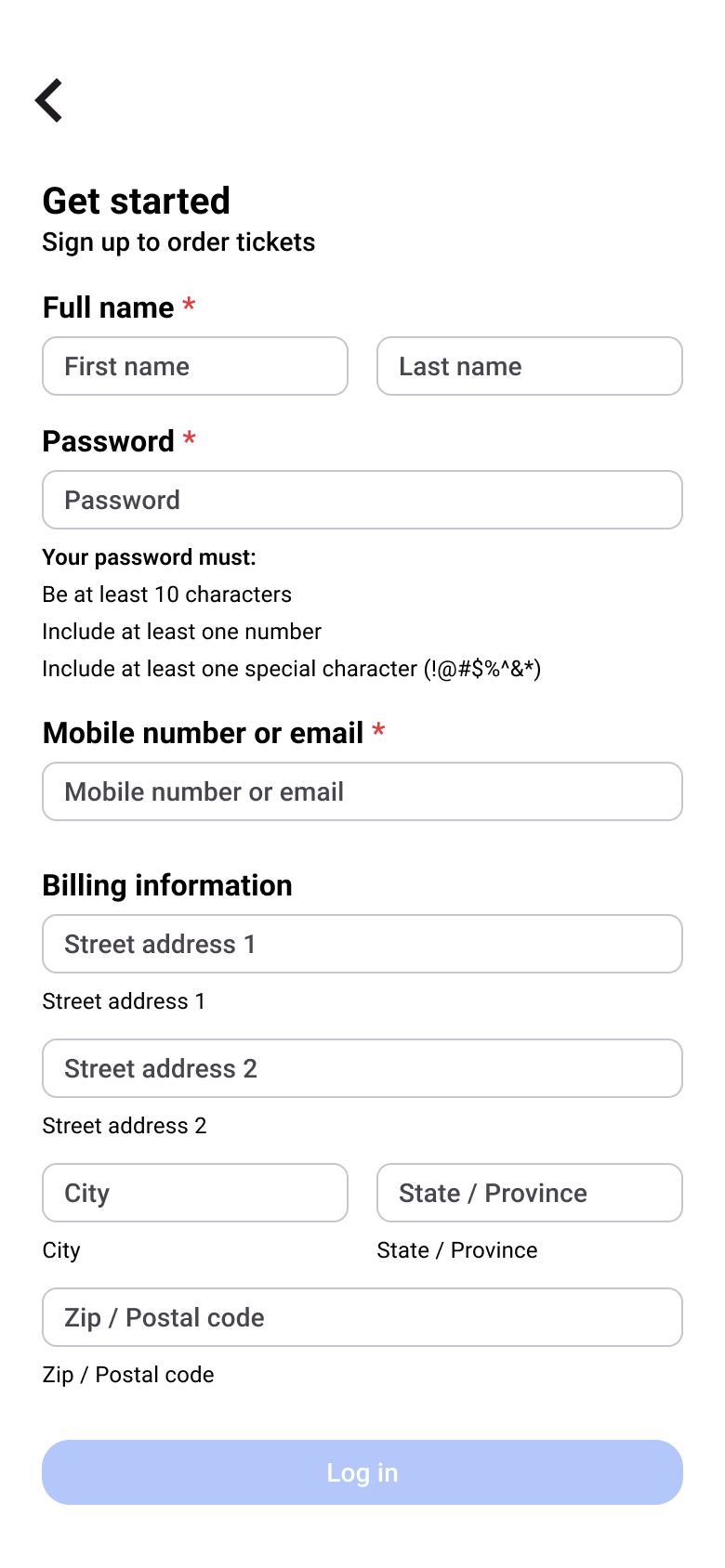
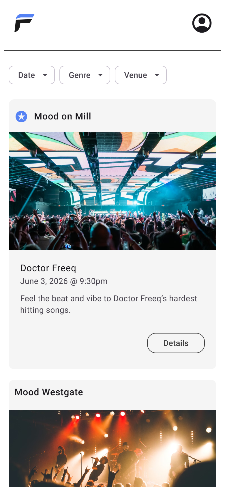
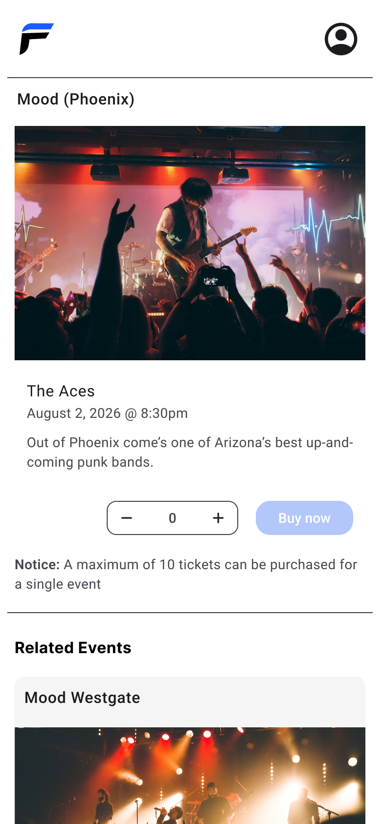
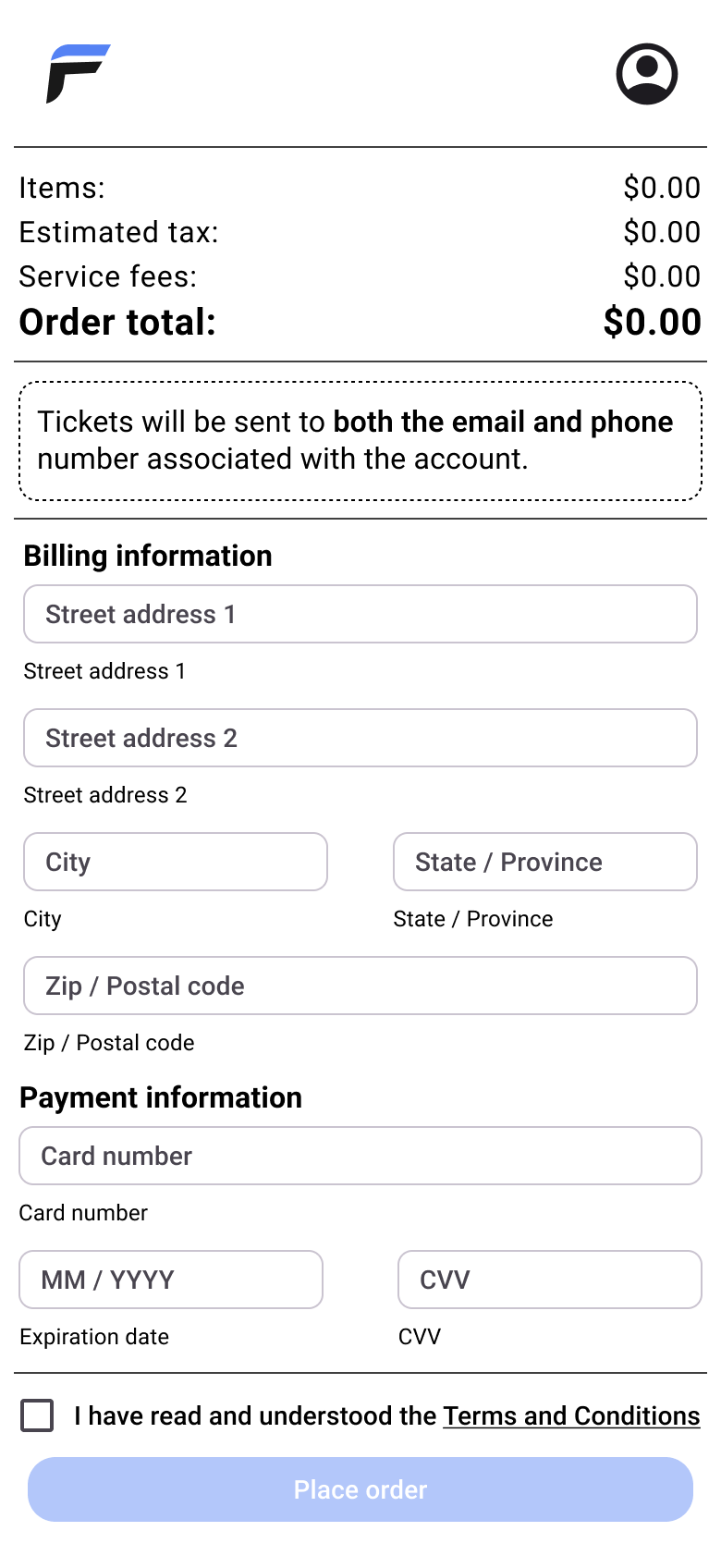
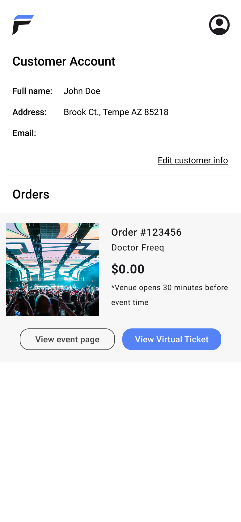
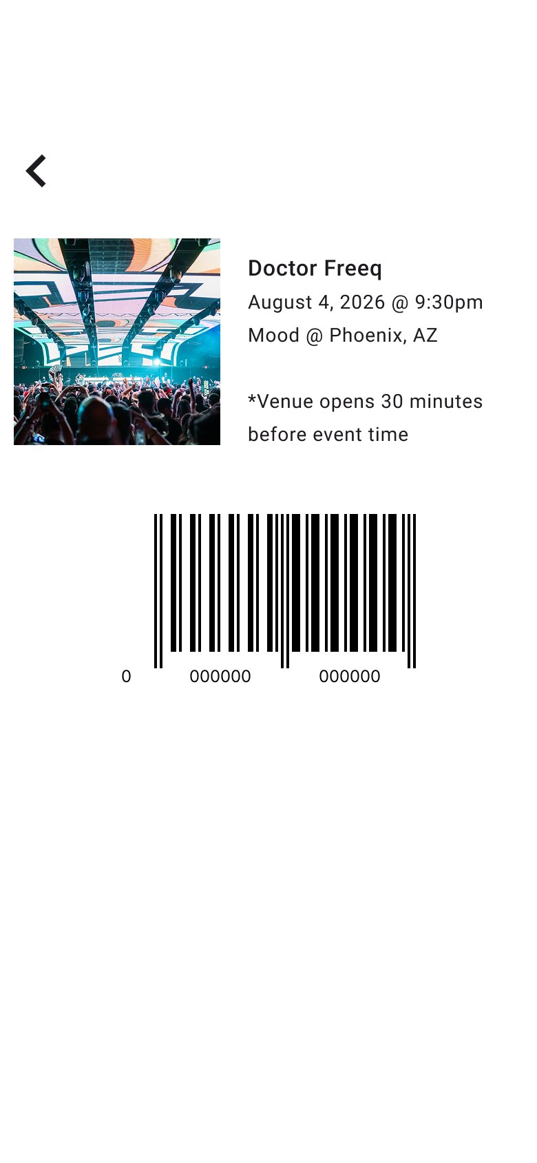
With wireframes complete, I layered in interactions to bring four key user flows to life: account sign-up, sign-in and ticket purchase, filtered event discovery, and ticket retrieval. Each flow was prototyped to reflect how a real user would move through the app.
Interactions were kept intentionally lean, with every tap purposeful and every transition direct. With this appoach, users could complete tasks without friction or confusion.
07 - outcome & Reflection
What mobile design taught me
Mobile design pushed back harder than I expected. The constraints of a small screen weren't just technical hurdles, but helped force sharper prioritization and more deliberate decisions at every step.
That challenge turned out to be the most valuable part of the project. It reinforced that good design isn't about having freedom; it's about making the most of the constraints you're given. Every limitation revealed a new way to think about the problem.